Why Modern Websites Are Ditching Static Lines for SVG Magic!

Modern SVG lines have become a game-changer. They provide a sleek, scalable, and visually appealing way to add dynamic elements to websites. Unlike traditional raster images, SVG (Scalable Vector Graphics) lines maintain sharpness across all screen sizes while ensuring fast loading times.
In this article, we’ll explore how modern SVG lines can transform your web design, their benefits, and how you can implement them for maximum impact.
Why Use Modern SVG Lines in Web Design?
SVGs have revolutionized web design, and SVG lines specifically add a modern, minimalist aesthetic while enhancing site performance. Here’s why they stand out:
✅ Scalability Without Quality Loss
SVGs are vector-based, meaning they scale infinitely without losing resolution. Whether on a mobile screen or a 4K display, SVG lines remain crisp and sharp.
✅ Lightweight & Fast-Loading
Unlike PNGs or JPGs, SVGs are code-based, meaning they don’t require large image files. This reduces website load times and improves SEO rankings.
✅ Customizable with CSS & JavaScript
SVGs aren’t static—you can animate and style them dynamically. Using CSS and JavaScript, you can create interactive line animations, hover effects, and dynamic transitions.
✅ Cross-Browser Compatibility
SVG lines work across all modern browsers, ensuring a consistent look and feel on different devices.
How to Implement Modern SVG Lines in Web Design
1. Using Basic SVG Line Code
The simplest way to integrate an SVG line is by writing inline SVG in HTML:
html
This creates a straight horizontal line that stretches across the width of the screen.
2. Styling SVG Lines with CSS
You can modify the color, thickness, and stroke style using CSS:
css
This code adds a modern color scheme and a dashed effect to the line.
3. Animating SVG Lines with CSS
To create a smooth drawing effect, use the stroke-dasharray and stroke-dashoffset properties:
css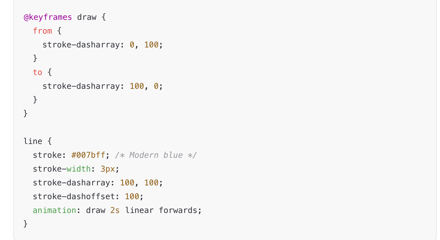
This animates the line so it appears to be drawn on the screen dynamically.
4. Creating Interactive SVG Lines with JavaScript
You can also use JavaScript for hover effects and dynamic interactions:

This code changes the line’s color when the user hovers over it, making it more interactive.
Best Practices for Using Modern SVG Lines in Web Design
✔ Use SVGs for Minimalistic UI Elements
Modern flat and minimalist web design benefits from clean, thin SVG lines used as dividers, borders, and separators.
✔ Optimize SVG Code for Performance
Remove unnecessary attributes and use inline SVGs to prevent extra HTTP requests.
✔ Combine SVG with CSS & JavaScript for Dynamic Effects
Use CSS animations for smooth transitions and JavaScript for interactivity.
✔ Ensure Mobile Responsiveness
Always use relative units (% instead of px) to ensure SVG lines scale properly on all devices.

One of the most exciting applications of modern SVG lines is in website navigation and menus. Traditional navigation elements, such as underlines, dividers, and dropdown indicators, often feel rigid and uninspired. By replacing them with animated and interactive SVG strokes, designers can create a more engaging and fluid user experience that feels cutting-edge.
Let’s dive deeper into why SVG lines are revolutionizing web navigation and how they can be used effectively to replace static elements.
How SVG Lines Are Transforming Website Navigation & Menus
SVGs provide a level of customization and animation that static lines simply can’t match. From hover effects to expanding borders and animated transitions, SVG lines introduce movement and interactivity into the navigation system of a website, making it feel more alive and dynamic.
1. Animated Underlines for Navigation Links
Traditionally, designers have used CSS underlines to highlight active or hovered navigation links. However, these effects often feel static and generic. With SVG, underlines can be animated, creating a smooth drawing effect that gives the navigation bar a more modern and polished feel.
For example, instead of simply switching the color of an underline when a user hovers over a link, SVG strokes can expand, fade in, or slide dynamically, guiding the user’s focus in an elegant way.
The benefits of SVG underlines in navigation menus include:
More engaging hover effects that create a seamless transition between inactive and active states.
Fluid animations that make interactions feel intentional and smooth.
Custom styling possibilities, such as dashed, wavy, or gradient-colored strokes.
This type of subtle animation enhances the browsing experience, making navigation more intuitive and visually appealing.
2. Interactive Menu Borders & Dividers
Many websites use horizontal and vertical dividers to separate navigation elements. These are often created with static CSS borders or simple div containers, but they lack personality and responsiveness.
By replacing them with SVG lines, designers can introduce:
Wavy or curved dividers that adjust dynamically as the page scrolls.
Expanding line animations that make menu transitions smoother.
Customizable stroke effects such as dots, dashes, or dual-color gradients.
These enhancements add a layer of sophistication to website navigation, making menu structures feel less rigid and more fluid.
Additionally, SVG dividers can be animated to respond to user behavior. For example, when a user scrolls down, the divider could gradually fade in or extend, creating a more immersive browsing experience.
3. Animated SVG Lines in Dropdown Menus
Dropdown menus are essential in modern web design, but traditional dropdown indicators (such as simple arrows or static borders) often feel outdated. With SVG lines, dropdown animations can be made more dynamic and engaging.
For instance, instead of using a simple static arrow to indicate a dropdown menu, designers can:
Use SVG strokes that gradually expand to reveal a submenu.
Create a wavy or bouncing line effect to indicate motion.
Implement color-changing strokes that highlight the menu interaction.
These effects make menu transitions feel more natural and visually engaging, helping to guide the user’s focus without feeling overwhelming.
4. Enhancing Mobile Navigation with SVG
With the rise of mobile-first design, navigation elements need to be lightweight and adaptable. SVG lines excel in mobile interfaces because they:
Scale effortlessly without losing clarity or resolution.
Take up less space compared to image-based elements.
Reduce page load times, improving mobile performance and SEO.
SVGs can also be integrated into mobile navigation menus to create effects such as:
Expanding lines that indicate menu activation.
Animated strokes that show menu hierarchy.
Interactive touch effects that enhance user engagement.
By using SVG-powered navigation elements, websites can maintain a sleek, modern look across all screen sizes, ensuring a consistent experience.
Why SVG Is Replacing Static Lines in Modern Web Design
SVGs aren’t just a design trend—they are quickly becoming the standard for modern web navigation. Here’s why more designers are choosing SVG over traditional CSS borders and static images:
1. Scalability Without Loss of Quality
Unlike PNGs or JPGs, SVG lines are vector-based, meaning they never become pixelated no matter how much they are resized. This ensures a crisp, clean design on any device.
2. Improved Website Performance & SEO
Since SVGs are code-based, they require fewer HTTP requests than images, leading to:
Faster page load times.
Better performance on mobile devices.
Higher search engine rankings due to improved site speed.
3. Customization & Interactivity
With SVGs, designers can use CSS and JavaScript to create:
Hover animations that guide user interaction.
Scrolling effects that enhance storytelling.
Transitions that improve overall website flow.
4. Modern & Minimalist Aesthetic
Flat, clean designs dominate today’s web design trends. SVG lines fit perfectly into minimalist UI/UX concepts, making web navigation look sharp and high-end.
OConclusion: The Future of Web Navigation is SVG
As web design continues to evolve, static lines and traditional borders are rapidly being replaced by modern, dynamic SVG elements. SVG lines offer a level of flexibility, scalability, and interactivity that traditional methods simply can’t match.
From animated underlines in navigation menus to fluid, responsive dividers and engaging dropdown transitions, SVG-powered design elements create a seamless, high-performance user experience. By adopting SVG for navigation and menu structures, designers can:
✅ Enhance visual appeal with smooth animations and custom styling.
✅ Boost website performance with lightweight, fast-loading graphics.
✅ Improve user engagement with interactive elements that respond to actions.
✅ Ensure scalability and responsiveness across all devices.
The digital landscape demands clean, dynamic, and immersive experiences, and SVG lines are the key to achieving that. If you’re still relying on static dividers and outdated CSS borders, it’s time to upgrade your web design strategy.
More Articles
The Ultimate Cyber Security Website Design: Protect & Impress in 2025!
How to Optimize Your Website for Faster Speeds
Drag-and-Drop Website Builders vs. Coding: Which is Better for You?
Affordable Website Design Packages: Build Your Dream Website on a Budget
Why Organic Asymmetric Shapes Are Taking Over Web Design in 2025
