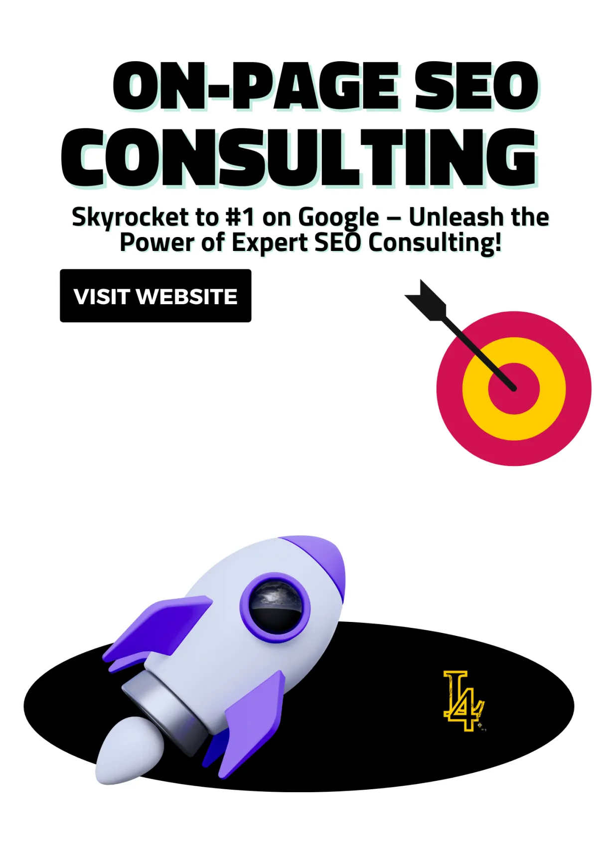

Essential Types of Webpages for Every Website (With Examples)
The Different Types of Webpages You Gotta Know to Level Up Your Site
When I first started building websites, I thought every page was the same. A homepage here, a contact page there—boom, done, right? Nah, fam. That’s like thinking every sneaker is the same just ‘cause they go on your feet. There are different types of webpages, and knowing how to use each one is the secret sauce to making your site pop off.
So, if you’re serious about building a dope website that actually works, let me put you on game with these essential types of webpages. Let’s break it down!
type of webpage
The Different Types of Webpages You Gotta Know to Level Up Your Site
1. Homepage: The First Impression King 👑
What You Need to Rule the Homepage Game
Extra Sauce to Make Your Homepage Unstoppable
2. About Page: Your Story, But Make It Interesting 📖
What You Need to Make Your About Page Pop
Extra Sauce to Make Your About Page Shine
3. Services Page: Show ‘Em What You Got 💼
4. Product Page: Sell It Like It’s Hot 🛒
What You Need to Make Your Product Page Pop
Extra Sauce to Make Your Product Page Irresistible
Pro Tip: Keep It Smooth and Mobile-Friendly
Why Your Product Page Has to Be Fire 🔥
5. Blog Page: Talk Your Talk ✍️
What You Need to Make Your Blog Page Lit
Extra Sauce to Keep Your Blog Poppin’
Why Your Blog Page is the Real MVP
6. Contact Page: Don’t Be Hard to Reach 📞
What You Need to Keep It Simple
Bonus: Add Some Personality to Your Contact Page
Why a Solid Contact Page Matters
What You Need to Make Your Landing Page Unstoppable
Why Your Landing Page Is the MVP
Final Pro Tip: Test, Tweak, Repeat 🔄
8. FAQ Page: Answer Before They Ask 🤔
What You Need to Make Your FAQ Page Fire
Bonus FAQ Page Ideas to Go the Extra Mile
Why Your FAQ Page is Low-Key a Sales Page
9. Portfolio Page: Show Off Without Being Extra 🎨
What You Need to Make Your Portfolio Pop
How to Keep Your Portfolio Sleek and Professional
Extra Portfolio Sauce: Stand Out From the Crowd
Final Thoughts: Flex Smart, Not Hard
0. Testimonial Page: Let Others Hype You Up 🗣️
What You Need to Make Your Testimonial Page Pop
How to Organize Your Testimonial Page Like a Pro
How to Get Killer Testimonials
Recommended Articles
2025’s Design Revolution: Tools, Trends, and Transformations You Need to Know
Turn Clicks to Cash: Build a Web Template That’s Straight Heat
Master the Art of Web Page Outlines: Your Blueprint for a High-Performing Website
8 Must-Have Features for the Perfect Video Website Template (Make Your Videos Stand Out!)
Free IT Website HTML Templates: Download and Build Your Dream Site Today!

1. Homepage: The First Impression King 👑
Your homepage is the MVP of your entire website. It’s like pulling up to someone’s house for the first time. If the lawn is a mess and the doorbell doesn’t work, you’re probably not staying for dinner. Same goes for your website. If your homepage isn’t on point, visitors are dipping faster than your Wi-Fi during a storm.
This is your shot to impress, so make it count. Your homepage needs to be clean, bold, and straight-up inviting. It’s the “what’s good” handshake that either pulls people in or sends them running. You’ve got about 5 seconds to make them stay, so let’s break down how to make your homepage the King it was born to be. 👑
What You Need to Rule the Homepage Game
🔥 A Bold Headline That Screams "I’m Different!"
Your headline should slap—hard. It needs to instantly tell visitors what you’re about and why they should care. None of that weak “Welcome to My Website” nonsense. Nah, fam. Hit ‘em with something that makes them say, “Okayyy, I need to see more.”
Examples That Hit:
“Transforming Ideas into Stunning Websites.”
“Unlock Your Style—Fashion That Speaks for You.”
“Hungry? We Deliver Flavor, Not Just Food.”
👀 Eye-Catching Visuals (No Dusty Stock Photos, Please)
Listen, visuals are everything. If your images look like they were downloaded from a free clipart site in 2005, we have a problem. Use high-quality images or graphics that match your vibe. Bright, clean, and bold visuals can make even a simple homepage feel high-end.
Pro Move:
Use vibrant hero images or videos in the background.
Show real photos of your product, service, or YOU!
Minimalist design with pops of color can be 🔥.
💥 A Strong CTA (Call-To-Action) That DEMANDS Attention
You gotta tell people what to do next. Otherwise, they’re just vibing with no direction. Your CTA should be big, bold, and crystal clear.
Examples That Convert:
“Shop the Collection”
“Get Your Free Quote”
“Let’s Build Something Epic”
🛑 Pro Tip: Don’t drown your homepage in 15 CTAs. One or two solid ones are enough. Keep it clean.
Extra Sauce to Make Your Homepage Unstoppable
⚡ Fast Loading Time
If your homepage takes longer than 3 seconds to load, you’re losing visitors. Nobody’s waiting around for a slow site. Optimize those images, tighten up your code, and make sure your site moves fast.
🔍 Clear Navigation
Your menu needs to be simple. No one wants to play “Where’s Waldo?” just to find your Contact page. Keep it tight—4 to 6 main links max.
✨ Above-the-Fold Magic
Anything that shows up on the screen before people start scrolling? That’s prime real estate. Your headline, visuals, and CTA need to live there. Don’t make visitors scroll just to find out what you do.
🖼️ Visual Hierarchy
Big bold headline ➔ High-quality image ➔ Strong CTA. This is the natural flow people expect. Lead their eyes where you want them to go.
🌎 Make It Mobile-Friendly
Over half of web traffic comes from phones. If your homepage doesn’t look good on mobile, you’re toast. Use responsive design so it looks fly on any device.
Why Your Homepage is THE King
Your homepage isn’t just a page—it’s the VIP entrance to your brand. It’s where you prove why you’re worth sticking around for. Whether you’re selling sneakers, booking clients, or sharing your creative work, the homepage needs to guide visitors to the next step without making them think twice.
Think of it like this:
Your Headline? That’s your pick-up line.
Your Visuals? That’s your outfit.
Your CTA? That’s you saying, “Let’s make this official.”
So, polish that crown and make your homepage the King it was born to be. 👑

2. About Page: Your Story, But Make It Interesting 📖
Your About Page is not your dusty LinkedIn bio. Nobody’s here to read a corporate resume or a boring “mission statement.” This is where people wanna vibe with YOU. They wanna know who’s behind the brand, what you’re about, and why they should care.
So, don’t be shy! This is your moment to tell your story and make it hit different. Be real. Be relatable. Be unforgettable.
What You Need to Make Your About Page Pop
🔥 A Quick Intro That Feels Personal
Start with something that feels human. Not “We were founded in 2012...” Nah, fam. More like, “It all started in my grandma’s kitchen with a bag of flour and a dream.” Boom. Now people are listening.
Examples That Hit:
“I started this brand because I was tired of boring fashion. So, I made my own.”
“After years of working a 9-to-5 I hated, I took a leap and started building websites from my tiny apartment.”
“We’re a small team with big ideas, turning caffeine and creativity into designs that actually work.”
📸 A Photo That Shows You’re Real
Throw in a picture of you or your team. Not some stiff, awkward headshot where you look like you’re about to file taxes. Nah. Show some personality. Maybe you’re laughing, working, or chilling with your team.
Pro Move:
Show yourself in action: designing, creating, serving customers.
Use natural, candid shots. No stock photos, please.
If it’s just you, own it! A solo photo with some style is 🔥.
💼 A Little Flex, But Make It Smooth
Yeah, it’s okay to brag a little. But don’t just list a bunch of achievements—connect them to how you help your audience win. People wanna know why YOU are the person they should trust.
Examples That Hit:
“We’ve helped over 500 brands glow up online—and yours is next.”
“Featured in [Insert Cool Place], but our proudest moments are helping small businesses grow.”
“From side hustle to full-time boss, I know what it takes to build something from nothing.”
Extra Sauce to Make Your About Page Shine
🎯 Connect with Your Audience
Talk to your audience, not at them. Use words they understand and vibe with. If you’re helping entrepreneurs, speak their language. If you’re talking to creatives, let your personality flow.
Example:
Wrong: “We strive to provide innovative solutions for our customers.”
Right: “We build websites that don’t just look good—they bring in sales. Period.”
🌟 Share Your Why
People don’t just buy products—they buy stories. Share why you started. What problem did you see that needed solving? What inspired you to create your brand? That’s the stuff people connect with.
Example:
“I started this skincare line because I was tired of products that didn’t work for my skin tone. So, I made my own.”
🛠️ Show How You Help People Win
Okay, cool—you’ve done some dope things. Now, tell visitors how that benefits THEM. Shift from “me, me, me” to “here’s how I can help you.”
Example:
“After launching three successful online stores, I’m sharing my best strategies so you can launch yours.”
📝 Keep It Short and Sweet
Nobody’s tryna read a novel. Keep your About Page tight but powerful. Tell your story, flex a little, and wrap it up with how they can connect with you.
Pro Tip:
End with a Call-To-Action! Don’t let people vibe with your story and then leave. Tell them what to do next.
Examples:
“Ready to level up your brand? Let’s chat.”
“Check out our latest projects!”
“Follow us on Instagram for behind-the-scenes action.”
Why Your About Page Matters
Your About Page is where strangers turn into supporters, followers, and loyal customers. It’s your chance to make them say, “Yo, I like this person. I trust them. I wanna buy from them.”
So, ditch the boring bio. Tell your story. Be real. Be bold. And show them why YOU’RE the one they need in their corner.
3. Services Page: Show ‘Em What You Got 💼
If you’re offering something, don’t make people guess. Your Services Page is where you clearly lay out what you do and why you’re the best choice. No fluff, no confusion—just straight-up value.
What You Need:
✅ Clear Descriptions of Each Service
Break down every service you offer in simple, easy-to-understand terms. Let visitors know exactly how you can help them.
✅ Pricing? Optional, But Be Real
Be upfront if you can. Transparent pricing builds trust. If your services vary, provide starting rates or invite people to contact you for a quote.
✅ Testimonials or Reviews
Social proof is powerful. Show off reviews or success stories to back up your expertise.
Pro Tip:
Use bullet points. Nobody’s got time for walls of text. Make it skimmable and to the point.
Example Layout:
🔹 Web Design & Development
Custom website designs tailored to your brand
Mobile-friendly and responsive layouts
SEO optimization included
🔹 Social Media Management
Content creation and scheduling
Audience engagement strategies
Monthly performance reports
🔹 SEO Consulting
Keyword research and strategy
On-page and off-page SEO optimization
Monthly traffic analysis
4. Product Page: Sell It Like It’s Hot 🛒

Alright, listen up! If you’ve got an online store, your Product Page is the MVP. This is where the deals go down. Where browsers turn into buyers. You can have the dopest products in the game, but if your product page is trash, nobody’s buying.
This page needs to be clean, smooth, and make people wanna slam that “Add to Cart” button like they’re playing Whac-A-Mole. You’re not just selling products—you’re selling an experience. So let’s make it pop! 💥
What You Need to Make Your Product Page Pop
📸 High-Quality Product Pics (Angles Matter!)
Yo, blurry pics and bad lighting? Nah, that’s not it. Your product photos need to be crispy, clear, and show off every angle. People can’t touch or feel your product, so your photos gotta do all the talking.
Pro Moves:
Show the product from multiple angles.
Zoom-in shots for texture and details.
Lifestyle photos—show the product in action!
Example:
Selling sneakers? Show close-ups of the stitching, side views, and someone rocking them in the streets.
💰 Clear Pricing, Sizes, and Options
Ain’t nobody got time to search for the price or figure out if you’ve got their size. Keep all that info front and center. Simple, clear, no games.
What to Include:
Price: Bold and easy to spot.
Sizes/Options: Dropdowns or buttons for easy selection.
Stock Info: Let them know if it’s limited—“Only 3 left!” adds that urgency!
Pro Tip: Offer size guides or comparison charts to help people make quick decisions. Nobody likes guessing.
🔥 A Bold Call-To-Action (CTA)
Your CTA button should be screaming, “Click me!” Make it big, bold, and clear. Forget weak CTAs like “Learn More.” Nah, hit ‘em with action.
Examples That Work:
“Buy Now”
“Add to Cart”
“Get Yours Before It’s Gone!”
“Snag This Deal!”
Pro Move:
Use color psychology. Bright colors (like red, orange, or green) can make your CTA stand out. Just make sure it pops off the page!
🌟 Use Customer Reviews (Your Secret Weapon)
Real talk: people trust other people more than they trust you. Reviews are GOLD. Show off those 5-star reviews and let happy customers sell your product for you.
What to Include:
Star ratings ⭐⭐⭐⭐⭐
Short, honest testimonials.
User photos of your product in real life.
Pro Move:
Highlight standout reviews at the top, and don’t be scared of a little feedback. It makes you look real and trustworthy.
Example:
“These shoes are FIRE. Super comfy, and I get compliments every time I wear them!”
“Came faster than expected, and the quality is A1. Will definitely buy again!”
Extra Sauce to Make Your Product Page Irresistible
🚀 Urgency and Scarcity
Make them feel like they need to buy now or miss out. FOMO is real.
Examples:
“Only 5 left in stock—order soon!”
“Sale ends in 2 hours!”
“Limited edition—won’t restock!”
🔒 Secure Payment Badges
Let’s be real—people want to know their money is safe. Add secure payment icons to build trust.
Examples:
PayPal, Visa, MasterCard logos.
“100% Secure Checkout” badges.
🎁 Special Offers and Free Shipping
Who doesn’t love a deal? Give people more reasons to buy.
Examples:
“Free shipping on orders over $50!”
“Buy 2, Get 1 Free!”
“First-time buyer? Use code WELCOME10 for 10% off.”
🎥 Product Videos (Game-Changer)
If a picture is worth 1,000 words, a video is worth a million. Show your product in action. Let customers feel how it works.
Ideas for Product Videos:
Unboxing videos.
Demo of how it works.
Customer testimonials on camera.
Pro Tip: Keep It Smooth and Mobile-Friendly
A lot of people shop from their phones, so your product page better look good on mobile.
Checklist:
Big, easy-to-click buttons.
Fast loading images.
Simple scrolling, no clutter.
If your page isn’t mobile-friendly, you’re leaving money on the table.
Why Your Product Page Has to Be Fire 🔥
Your product page is where the magic happens. This is where visitors become customers. So make it smooth, make it exciting, and most importantly, make it EASY.
People should scroll, say, “Oh snap, I NEED this,” and hit that Buy Now button without thinking twice.
So, show off those products, make your CTA pop, and let the sales roll in.
Now go out there and sell it like it’s hot! 🛒💸

5. Blog Page: Talk Your Talk ✍️
The Blog Page is your personal stage. This is where you flex your knowledge, drop gems, and show the world that you’re not just here to look cute—you’ve got brains too. Whether you're spilling industry secrets, sharing life hacks, or just ranting about something wild, a solid blog can bring in serious traffic and prove you're the real deal.
Think of it like this: Google is always nosy, looking for fresh content. If your blog is poppin’ with useful posts, it’s gonna pull up more people to your site. And that means more eyes, more clicks, and more opportunities.
What You Need to Make Your Blog Page Lit
💡 Posts That Actually Help People
Nobody wants to read fluff. Your posts need to answer real questions, solve problems, or at least make someone say, “Yo, that’s facts!”
What Works:
Tutorials and how-to guides (“How to Start a Side Hustle in 2025”)
Industry news and trends (“Top Web Design Trends You Can’t Ignore”)
Personal stories that connect with people (“What I Wish I Knew Before Launching My First Website”)
Pro Move:
Peep what people are searching for using tools like Google Trends or Answer the Public. Then, write about it. Simple.
🔥 Catchy Titles That Hit Hard (But No Clickbait, Fam)
Your title is your first impression—make it count. It should be spicy enough to make people click but not so wild that it’s giving off fake energy.
Examples That Work:
“5 Rookie Mistakes to Avoid When Starting a Website”
“How I Turned My Hobby into a Six-Figure Business”
“Why Your Website is Trashing Your Sales (And How to Fix It)”
Pro Tip:
Use numbers, questions, or power words like “secret,” “essential,” or “proven.” But keep it 100. Nobody likes to be catfished by a headline.
🗂️ Easy Navigation Between Posts
If your blog is a maze, people will dip. Keep it smooth. Help readers explore more without feeling lost in the sauce.
What I Did:
Added categories like “Tips,” “Trends,” and “Tutorials.”
Used tags for specific topics so readers can dive deeper.
Included a “Related Posts” section at the end of every article.
Pro Move:
Add a search bar so readers can find exactly what they need without scrolling forever.
💥 Visuals That Pop
No one’s trying to read a wall of text. Break it up with visuals! Images, infographics, and even memes (when they fit) can keep your audience engaged.
What Works:
Custom graphics made in Canva.
Screenshots for tutorials.
Gifs and memes for flavor.
Pro Tip:
Always use alt text for images so Google knows what’s going on. Plus, it makes your blog more accessible.
🔑 Sprinkle in Keywords (But Make It Smooth)
SEO isn’t just for tech geeks—it’s for anyone who wants their blog to actually be seen. Drop keywords naturally into your posts so Google knows what you’re about.
What I Did:
Researched keywords with Ubersuggest and Google Keyword Planner.
Used them in my titles, headers, and first 100 words.
Made sure it still sounded like me—no robotic writing.
Example:
If I’m writing about blog design, I’m sliding in phrases like “best blog layout” or “how to design a blog page” naturally.
Pro Move:
Use long-tail keywords (phrases with 3-5 words) to target specific searches. They’re easier to rank for and bring in more serious readers.
📅 Consistent Posting Schedule
A ghost town blog won’t bring in readers. If your last post was from 2018, you’re playing yourself.
What I Did:
Set a goal to post once a week (and actually stuck to it).
Batched content ahead of time so I wasn’t scrambling.
Used a content calendar to stay on track.
Pro Move:
Quality over quantity. Don’t post just to post. Make sure each blog is valuable and worth the read.
Extra Sauce to Keep Your Blog Poppin’
🔗 Internal Links:
Link to other posts on your blog to keep readers clicking around. It’s like saying, “Oh, you liked this? You’ll love this too!”
📧 Email Signup Forms:
Slide in a form asking readers to subscribe. Offer a freebie or exclusive content to get them on your list.
📲 Share Buttons:
Make it easy for people to share your posts on social media. One click, and your post could be everywhere.
👀 Add a Featured Post Section:
Highlight your best or most popular articles so new visitors know where to start.
Why Your Blog Page is the Real MVP
Your Blog Page isn’t just for writing. It’s a traffic magnet, a trust builder, and your secret weapon for flexing your expertise. Every post you write is like dropping a breadcrumb trail that leads people straight to your brand.
So, talk your talk, drop some knowledge, and give Google something to brag about.
Now go ahead and blog like a boss. ✍️💼
6. Contact Page: Don’t Be Hard to Reach 📞
If people are trying to reach you, don’t make them feel like they’re solving a mystery. This ain’t National Treasure, and nobody’s tryna decode clues to find your email. Your Contact Page needs to be clean, simple, and easy to use. If you make it too complicated, folks are bouncing before they even finish typing “hello.”
This page is your open invitation for people to hit you up. Whether it’s potential customers, collaborators, or someone just giving props, you gotta make it stupid easy for them to connect.
What You Need to Keep It Simple
📋 Short and Sweet Contact Form
No one wants to fill out a form that feels like a job application. Keep it light.
What Works:
Name (first name, last name if you’re feeling fancy)
Email (obviously)
Message box (let them say what they need)
Pro Move:
Add a dropdown for topics like “General Question,” “Work With Me,” or “Feedback” so you can stay organized.
📧 Your Email (Keep It Professional)
Nobody trusts a business using an old Yahoo or AOL email. Keep it professional but accessible.
What I Did:
Created a clean, branded email like hello@mywebsite.com or contact@businessname.com.
Made sure it’s visible and easy to copy or click.
Pro Tip:
If you’re not ready for a business email, at least use Gmail with your name. No one’s emailing partyguy_92@yahoo.com for serious inquiries.
📱 Optional Phone Number (If You’re About That Life)
Not everyone wants to give out their number, and that’s cool. But if it makes sense for your biz, drop it in.
What Works:
A business line or Google Voice number if you want to keep it separate.
Set clear hours when people can call or text so they’re not blowing you up at 2 AM.
Pro Move:
If you’re not about phone calls, skip it. But if customers need support or you’re booking appointments, it’s a good look.
🔗 Social Media Links (Where You Really Hang Out)
Let’s face it, people stalk your socials before they email you. Make it easy for them.
What I Did:
Linked my Instagram, LinkedIn, and Twitter (or X, whatever they’re calling it now).
Used recognizable icons instead of boring text links.
Only linked platforms I actually use. No ghost accounts.
Pro Tip:
Embed your latest Instagram feed or Twitter posts to make the page feel alive and connected.
📍 Map It Out (If You’ve Got a Physical Spot)
If you have a store, office, or spot people can visit, don’t make them guess where it is.
What I Did:
Embedded a Google Map right on the page.
Dropped my address underneath it for backup.
Why It Works:
Nobody wants to copy and paste your address into Google Maps. Make it clickable, zoomable, and super easy to find.
Pro Move:
Add parking tips or nearby landmarks so people don’t get lost. Trust me, they’ll appreciate it.
📸 A Friendly Photo (Optional But Nice)
A little personal touch never hurts. Let people know there’s a real human behind the screen.
What Works:
A casual, professional photo of you or your team.
A snapshot of your storefront or office.
Even a fun graphic that says, “Let’s Connect!”
Pro Tip:
Don’t use stiff, awkward headshots. Keep it chill but professional. Look approachable, not like you’re about to sell insurance.
Bonus: Add Some Personality to Your Contact Page
Look, your Contact Page doesn’t have to be boring. Sprinkle in some personality so people actually want to reach out.
Examples:
“Got Questions? Hit Me Up! 👇”
“Slide into my inbox (professionally, please).”
“Let’s Make Magic Happen 💌”
Pro Move:
Add a fun FAQ dropdown to answer common questions and cut down on back-and-forth emails.
Why a Solid Contact Page Matters
Think about it—this is the page that closes the deal. If someone’s made it this far, they’re interested. Don’t blow it by making it hard to reach you. Keep it smooth, simple, and welcoming.
Because nothing’s worse than someone leaving your site thinking, “Dang, I guess they don’t wanna be bothered.”
Make it easy. Make it inviting. Make it YOU.
Now go ahead and open those DMs! 📥
7. Landing Page: The Closer 🏆
Alright, this is it—the Landing Page. The grand finale. The moment where browsers turn into buyers, subscribers, or loyal fans. This page isn’t here to play games. It’s here to close the deal. Whether you’re pushing a product, offering a free download, or hyping up an event, your landing page has one job and one job only—GET THAT CLICK.
This ain’t the spot to get all fancy or flex every feature you have. Keep it clean, focused, and laser-sharp on the goal. If your homepage is the welcome mat, your landing page is the front desk that’s handing over the keys.
What You Need to Make Your Landing Page Unstoppable
🎯 One Clear Offer (Not 12)
Listen, this ain’t a buffet. Pick one thing you want visitors to do and make that the star of the show.
What I Did:
Focused on a single action: Sign up, Buy now, Download freebie.
Cut out all the extra fluff that could distract people.
Highlighted ONE benefit that solves their biggest problem.
Pro Tip:
If you’re offering a freebie, hype it up! Make it sound like they can’t live without it. “Get Your FREE Guide to Boost Sales!” sounds way better than “Download PDF.”
🔥 A Bold, Unmissable CTA (Call-To-Action)
Your CTA button should be screaming, “CLICK ME!” but in a cool way. Not whispering in the corner.
What Works:
Big, bold buttons that stand out.
Action words like “Grab Yours Now”, “Join the Crew”, or “Claim My Spot.”
Use colors that POP but still match your site’s vibe.
Pro Move:
Repeat the CTA a couple of times if it’s a long page. People shouldn’t have to scroll to hunt it down.
⏳ A Countdown Timer (Because FOMO is Real)
Nothing gets people moving faster than thinking they might miss out.
What I Did:
Used a countdown timer for limited offers or sales.
Phrases like “Only 2 Days Left!” or “Offer Ends Soon” light a fire under people.
Why It Works:
FOMO (Fear of Missing Out) is a powerful motivator. A ticking clock makes people feel like they need to act now or miss out forever.
Pro Tip:
Don’t fake the urgency. If your deal isn’t actually ending, don’t say it is. People can spot that shady move from a mile away.
📸 Eye-Catching Visuals (No Boring Stock Photos)
People are visual. A dope image can sell better than a wall of text.
What Works:
Product close-ups that show off details.
Action shots of people using your product or service.
Clean, professional graphics that highlight the offer.
Pro Move:
Use before-and-after photos if it makes sense for your product. Results speak louder than words.
💬 Testimonials and Social Proof (Let Others Hype You Up)
Why toot your own horn when others can do it for you?
What I Did:
Added real reviews and testimonials.
Showed off logos of brands I’ve worked with.
Included stats like “Join 10,000+ Happy Customers” or “5-Star Rated by 1,000 Users!”
Why It Works:
People trust people. If they see that others are vibing with your offer, they’re way more likely to hop on board.
Pro Tip:
Use short, punchy reviews. Ain’t nobody reading paragraphs on a landing page.
📱 Mobile-Friendly Design (Because Everyone’s on Their Phone)
If your landing page doesn’t look good on mobile, you’re losing money.
What I Did:
Tested my landing page on both phones and tablets.
Made sure buttons were big enough to tap.
Kept the design clean and easy to scroll.
Why It Works:
Most people are scrolling on their phones. If your landing page is janky on mobile, they’re gone.
Pro Move:
Keep text short. Bullet points over paragraphs. Less scrolling, more clicking.
📝 Keep It Simple, Keep It Focused
This ain’t the place to tell your life story. People clicked this page for a reason. Give them what they came for—FAST.
What I Did:
Used short, punchy headlines.
Broke down benefits with easy bullet points.
Got rid of extra links and distractions.
Why It Works:
Distractions kill conversions. One goal. One path. One big win.
Pro Tip:
If it doesn’t help your visitor click the CTA, cut it.
Why Your Landing Page Is the MVP
Your landing page is your MVP—your star player. This is where people decide if they’re in or out. The difference between a messy landing page and a fire one? Conversions. Sales. Growth.
If you keep it clean, bold, and focused, you’re stacking the odds in your favor. But if you overload it with fluff, options, and distractions, you’re just leaving money on the table.
Final Pro Tip: Test, Tweak, Repeat 🔄
Look, even the best landing pages need a little TLC.
Test different headlines.
Try new button colors.
Swap out images.
Sometimes, changing one word or color can skyrocket your clicks. So don’t just make it and forget it. Test it, tweak it, and watch it work.
Now Go Get That Click! 🚀
Your landing page is the closer. The finisher. The deal-sealer. So make it bold, make it simple, and make it impossible to ignore.
Now go out there and GET. THAT. CLICK. 💥
8. FAQ Page: Answer Before They Ask 🤔
Let’s be real—people always have questions. And if they can’t find answers fast, they’ll bounce quicker than a basketball. That’s where your FAQ (Frequently Asked Questions) page comes in clutch. It’s like your website’s personal assistant, handling all those “Wait, what?” moments before they even happen.
This page isn’t just for answering questions—it’s about building trust, clearing up confusion, and making your visitors feel like you get them. Because when people feel understood, they stick around. And when they stick around, they buy, subscribe, or whatever else you’re hoping for. 😉
What You Need to Make Your FAQ Page Fire
❓ Common Questions with Clear Answers
Think about what people are really wondering when they visit your site. Not just the obvious stuff. What might make them hesitate to buy, sign up, or trust you?
What I Did:
Listed out every question a customer has asked me.
Added answers that are short, clear, and straight-up helpful.
Organized them by category so it’s easy to skim.
Examples:
How long does shipping take? → “We ship within 2-3 business days, and delivery usually takes 5-7 days depending on your location.”
Can I return my order? → “Absolutely! You have 30 days to return it, no questions asked.”
Pro Move:
Check your email or DMs for questions people ask most. If they’re asking, they’re not finding that info on your site.
💯 Honest Info—No Dodging the Tough Stuff
Nobody likes shady answers or the runaround. If there’s something people might not love (like higher shipping costs or longer delivery times), own it. Transparency builds trust.
What I Did:
Gave honest answers, even for tricky questions.
Explained why certain things are the way they are.
Avoided sugarcoating the truth.
Example:
Why is shipping expensive? → “We get it—shipping costs are annoying. But we use premium, eco-friendly packaging to make sure your order arrives safe and sound. Plus, it’s better for the planet!”
Pro Tip:
Honesty makes people feel like they’re dealing with a real human, not a faceless company. And people buy from people they trust.
🔗 Links to Other Pages for More Details
Sometimes an answer needs more than a few sentences. Don’t turn your FAQ into a novel—drop a link and let them dive deeper if they want to.
What I Did:
Linked to my Return Policy for detailed info.
Dropped links to product pages when explaining features.
Directed users to my Contact Page if they needed extra help.
Example:
How do I track my order? → “Easy! Just click here to track your order anytime.”
Pro Move:
Use buttons or highlighted text to make links stand out. Make it stupid-easy to click.
🗣️ Keep It Casual—Talk Like a Human
Nobody wants to read robotic answers. Your FAQ page should sound like you—relatable, helpful, and friendly. Keep it conversational.
What I Did:
Wrote my answers like I was chatting with a friend.
Used simple language (no fancy jargon).
Threw in some humor where it felt right.
Example:
Do you offer gift wrapping? → “Oh, you’re fancy, huh? Yes! We offer gift wrapping at checkout. Go ahead and make it look extra special!”
Pro Tip:
If it sounds stiff or corporate, rewrite it. People vibe with brands that feel real and relatable.
Bonus FAQ Page Ideas to Go the Extra Mile
📹 Add Videos for Complex Answers:
Some answers are better shown than explained. Record a quick tutorial or walkthrough.
🤝 Include Social Proof:
If people ask about product quality, link to reviews or testimonials. Let your customers do the talking!
📝 Update Regularly:
FAQs aren’t a “set it and forget it” deal. If you start getting new questions, add them in! Keep it fresh and helpful.
Why Your FAQ Page is Low-Key a Sales Page
Here’s the secret: your FAQ page isn’t just about answering questions. It’s about removing doubts and clearing the path to that buy button. Every answer should guide visitors closer to taking action.
If your FAQ page is helpful, honest, and easy to read, it’s like giving your customers a reason to trust you. And trust turns into clicks, sign-ups, and sales.
So don’t sleep on your FAQ page—it’s more powerful than you think. Now go answer those questions before they even ask! 💬
9. Portfolio Page: Show Off Without Being Extra 🎨
If you’re in the creative game—whether you’re designing, painting, snapping photos, or building brands—the Portfolio Page is your time to shine! Think of it as your digital trophy case. This is where you flex your skills, but remember, it’s a flex, not a full-on ego trip. Keep it clean, sharp, and let your work speak louder than your words.
What You Need to Make Your Portfolio Pop
📸 High-Quality Images or Videos of Your Work
Listen, blurry photos and pixelated screenshots are not the move. Show your work in the best light—literally and figuratively.
What I Did:
Used crisp, high-res images that show every detail.
Uploaded videos for motion design and animations.
Made sure everything loaded fast (nobody’s waiting for your 20MB photo).
Pro Move:
Mockups! If your work is digital, use mockups to make it feel real and professional. A logo on a coffee cup hits different than a flat PNG.
📝 Brief Descriptions for Each Project
People wanna know the story behind your work. What was the project about? What problem did you solve? But keep it light—we ain’t writing a novel.
What I Did:
Added 2–3 sentences about each project.
Highlighted what made it unique or challenging.
Kept the text short, sweet, and snappy.
Example:
"Designed a rebrand for a local coffee shop. Focused on creating a cozy, modern vibe to attract younger customers. Sales increased 40% after the relaunch!"
Pro Tip:
Use bullet points if that fits your style. People skim, so make it easy to digest.
🔗 Links to Live Projects (If Possible)
Nothing hits harder than proof. If your work is live somewhere, drop that link and let people experience it for themselves.
What I Did:
Linked to live websites and apps I designed.
Shared direct links to campaigns or social media posts I created.
Opened links in new tabs (because I don’t want visitors leaving my site!).
Pro Move:
Add a quick CTA like “View Live” or “See It in Action” under your project description. Make it clear and clickable.
How to Keep Your Portfolio Sleek and Professional
🔥 Only Show Your Best Stuff—Quality > Quantity
Let’s be real: not every project is a masterpiece. And that’s cool! But your Portfolio Page is not the place to show everything you’ve ever made.
What I Did:
Picked 6–8 of my strongest projects.
Showed variety but kept it consistent with my brand.
Removed older work that didn’t match my current level.
Pro Tip:
If you feel "meh" about a project, leave it out. If it doesn’t make you proud, it won’t impress anyone else.
🎨 Keep the Design Simple and Let the Work Shine
Your Portfolio Page should feel like an art gallery—not a carnival. Minimal design makes your work pop. Avoid clutter and let your creativity speak.
What I Did:
Used white space to let each project breathe.
Chose clean fonts and neutral colors.
Avoided crazy animations that distract from my work.
Pro Move:
Use hover effects for subtle flair. Like, when you hover over an image, it zooms in or shows the project title. Classy, not flashy.
📱 Make It Mobile-Friendly
You already know the drill. People are scrolling on their phones, so make sure your portfolio looks just as good on a small screen.
What I Did:
Checked my page on phones and tablets.
Used responsive image grids that stack nicely.
Kept buttons big enough to tap easily.
Pro Tip:
Test your page on different devices. If images load weird or text cuts off, fix it. First impressions count!
Extra Portfolio Sauce: Stand Out From the Crowd
🎥 Add a Highlight Reel:
If you’re in video or motion graphics, create a short highlight reel. Keep it under 60 seconds and make it punchy!
🛠️ Show Your Process:
People love to see how you create. Add progress shots, sketches, or behind-the-scenes clips to make your work more relatable.
📣 Include Client Testimonials:
Got clients who loved your work? Ask for a quick quote and add it under their project. Social proof makes a difference!
🖼️ Curate a Theme:
Want to stand out? Pick a theme or style for your portfolio. Maybe all your images have a vintage filter, or you use bold, blocky layouts. Make it yours.
Final Thoughts: Flex Smart, Not Hard
Your Portfolio Page is where you prove you’re the real deal. But here’s the key: it’s not about how much you’ve done—it’s about how well you’ve done it. Show off, but keep it classy.
Let your work speak for itself, tell the story behind it, and make it easy for people to see, understand, and love what you do.
Now go ahead, drop that mic and let your work shine. 🎤✨
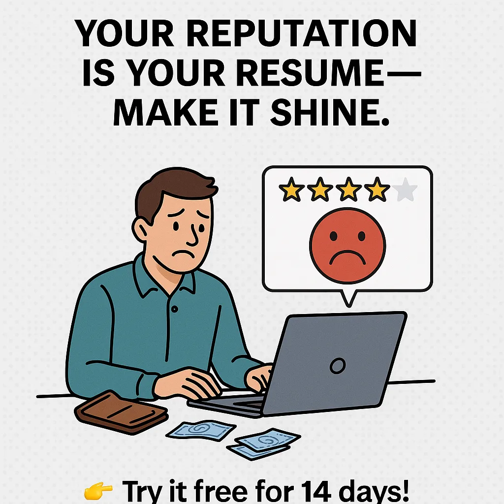
0. Testimonial Page: Let Others Hype You Up 🗣️
Look, you can shout from the rooftops about how amazing you are, but let’s be honest—people trust other people more than they trust you hyping yourself up. That’s why a Testimonial Page is the ultimate flex. Real voices. Real stories. Real results. Let your clients do the talking, and watch your credibility skyrocket!
What You Need to Make Your Testimonial Page Pop
📝 Real Reviews from Real People
Ain’t nobody got time for those vague, “Great service, 10/10” reviews. We’re talking about authentic feedback that tells a story.
What I Did:
Asked past clients to share honest feedback about working with me.
Highlighted specific results or improvements I helped them achieve.
Made sure the reviews felt natural, not stiff or scripted.
Example:
"Before working with [Your Name], our website was struggling. Now? We’re ranking on Google and our sales doubled in three months. Couldn’t be happier!" — Jamie L., Small Business Owner
Pro Move:
Ask clients to mention specific numbers or outcomes. “Increased sales by 40%” hits way harder than “They did a great job.”
📸 Short Quotes with Names (and Pics if Possible)
People trust faces. A quote with a name is good, but add a photo? Now it feels real.
What I Did:
Collected headshots (with permission) to go with testimonials.
Used first and last names for transparency.
Included their job title or company if it made sense.
Pro Tip:
If clients are camera-shy, a logo of their business works too. It adds trust without making anyone uncomfortable.
🎥 Video Testimonials? Even Better
Nothing beats seeing and hearing a satisfied client speak for themselves. Videos are gold for testimonials.
What I Did:
Asked happy clients for quick 30-second videos sharing their experience.
Kept it casual—no need for fancy editing. Authentic is better.
Uploaded videos to YouTube and embedded them on my site.
Pro Move:
Keep videos short and sweet. Nobody’s watching a 10-minute thank-you speech. A quick, enthusiastic “This changed my business!” is perfect.
How to Organize Your Testimonial Page Like a Pro
💬 Mix It Up with Different Formats
Not every testimonial has to look the same. Variety keeps things interesting!
What I Did:
Used a mix of text quotes, video clips, and audio snippets.
Created a scrolling carousel for testimonials to save space.
Highlighted standout reviews in bold or larger text.
Pro Tip:
Feature your BEST testimonial at the top of the page. First impressions matter!
🗂️ Categorize Testimonials by Service or Product
If you offer different services or products, organize your reviews so visitors can easily find what matters to them.
What I Did:
Split testimonials into categories like “Web Design,” “SEO Services,” and “Consulting.”
Used tabs or dropdowns for smooth navigation.
Pro Move:
Add a filter or search bar if you have tons of reviews. Make it effortless for visitors to find the feedback that speaks to them.
🔗 Link Testimonials to Case Studies or Projects
Why stop at reviews? Show off the results behind the praise by linking testimonials to detailed case studies.
What I Did:
Linked client quotes to full project breakdowns.
Used “Read More” buttons under longer testimonials.
Pro Tip:
This is perfect for high-ticket services. People want proof, so give them the full story!
How to Get Killer Testimonials
🙋♂️ Ask at the Right Time
Timing is everything. Ask for feedback when clients are the happiest—like right after a successful project launch or big win.
What I Did:
Sent follow-up emails after project completion.
Included a link to a simple feedback form.
Pro Tip:
Make it easy. Give them 2–3 quick questions to answer, or offer to draft a testimonial for them to approve.
🎁 Sweeten the Deal (If It Makes Sense)
Incentives can motivate clients to leave a review, but keep it classy.
What I Did:
Offered a small discount on future work for detailed feedback.
Entered reviewers into a giveaway for a free consultation.
Pro Move:
Never pay for fake reviews. But a small thank-you for honest feedback? That’s just good business.
Why Testimonials Are the Secret Sauce
We all know —people trust people. No matter how slick your website is, it’s real reviews that seal the deal. A killer Testimonial Page is the difference between “Hmm, maybe…” and “TAKE MY MONEY.”
So, let your happy clients talk their talk. Their words are worth more than any ad you could pay for. Now go ahead and let the world know you’re the real deal! 💥.
Conclusion: Mix and Match Your Web Pages Like a Pro
Building a website isn’t just about throwing pages together. You need to mix the right types of webpages to tell your story, sell your product, or share your ideas. Every page has a purpose. Don’t sleep on it!
So, whether you’re just getting started or leveling up your site, knowing how to use these pages will make your site run smoother than butter on toast.
Now go on, build something amazing—and make sure it’s not hiding in the shadows.