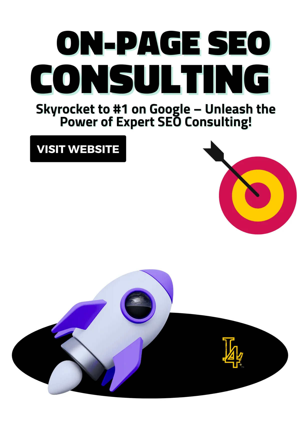

Master the Art of Web Page Outlines: Your Blueprint for a High-Performing Website
Jumping straight into building a website without a plan? Rookie move. It’s like trying to build a mansion without a blueprint—you’re bound to get lost. That’s where a web page outline saves the day. It’s your game plan, your GPS, your “don’t-get-lost” guide. Trust me, once I nailed down how to create a solid web page outline, designing websites felt like second nature. Now, I’m about to put you on so you can design smarter, not harder.

Master the Art of Web Page Outlines: Your Blueprint for a High-Performing Website
Creating a Web Page Outline That Works
1. Homepage Outline: First Impressions Hit Different 👀
Extra Sauce for Your Web Page Outline:
Web Page Outline for Your About Page: Tell Your Story, Keep It Real 📖
1. Bold Introduction: Start with Impact
2. The Real Story: Your Journey So Far
3. Meet the Team (Even If It’s Just You)
4. Your Mission & Values: What Drives You
5. Social Proof: Show Off Your Wins
6. Call-to-Action: What’s Next?
Web Page Outline for Your Services or Products Page: Make It Irresistible 💼
1. Bold Header: Make an Entrance 🚪
2. Clear Service/Product Categories 📦
3. Scroll-Stopping Product/Service Features 🛠️
5. Customer Reviews & Testimonials 🗣️
6. Clear Call-to-Action (CTA) Buttons 🚀
7. Frequently Asked Questions (FAQs) 🤔
8. Limited-Time Offers & Urgency 🔥
10. Seamless Checkout or Booking 🛒
Final Touches: Make It Feel Premium ✨
Web Page Outline for Your Blog Page: Keep It Real and Engaging ✍️
1. Bold Blog Header: Make an Entrance 📝
2. Featured Posts Section: Lead With Your Best 🔥
3. Categories & Tags: Keep It Organized 📂
4. Engaging Blog Post Previews: Hook ‘Em Early 🎣
5. Blog Post Structure: Write Like You Talk 🗣️
6. Visuals & Media: Break Up That Text 🎥
7. SEO Game Strong: Get Found on Google 🔍
8. Strong Call-to-Action (CTA): Keep Readers Moving 🚀
9. Comment Section: Start Conversations 💬
10. Easy Social Sharing: Let Readers Spread the Word 📲
Final Touch: Keep It Updated 🔄
Contact Page Outline: Make It Easy to Reach You 📞
What to Include in a High-Converting Contact Page
📬 Contact Form: Keep It Simple and Clean
📞 Phone Number: Let Them Hear Your Voice
📧 Email Address: For the Formal Folks
📱 Social Media Links: Meet Them Where They Are
📍 Map: For Businesses with a Physical Location
Extra Sauce: Take It Up a Notch
Portfolio Page Outline: Flex Your Best Work 💼
What to Include in a High-Impact Portfolio Page
🎨 Featured Projects: Show Off Your Best Work
🗂️ Organized Categories: Make It Easy to Browse
📈 Results & Testimonials: Show the Impact
🚀 Call-to-Action (CTA): Invite Them to Work With You
🆕 Keep It Fresh: Stay Relevant
Testimonials Page Outline: Let Them Speak For You 🗣️
What to Include in Your Testimonials Page Web Outline Template:
💬 Short Quotes: Quick & Powerful Feedback
🎥 Video Testimonials: Bring the Hype with Real Faces
⭐ Ratings/Stars: Visual Proof People Trust
🖼️ Visual Proof: Show the Results
🚀 Call-To-Action (CTA): Turn Proof Into Action
Pro Tips for Designing the Perfect Testimonials Page
2. Use a Clean, Simple Layout:
How This Fits into Your Web Page Outline
FAQ Page Outline: Answer Before They Ask 🤔
What to Include in Your FAQ Page Outline:
Pro Tips for a Winning FAQ Page Design:
Example FAQ Page Layout for Your Website Outline:
0. Sitemap Page Outline: For the Organized Ones 📄
What to Include in Your Sitemap Page Outline
📑 Complete List of All Website Pages
📂 Organized by Category for Easy Navigation
🔄 Regular Updates: Keep It Fresh
🌐 Link to XML Sitemap (Optional but Powerful)
🔍 Add a Search Bar for Extra Convenience
Pro Tips for a Killer Sitemap Page
5. Use Anchor Links for Long Sitemaps
Why a Sitemap Page Is Essential for Your Website Outline Template
5. Use Anchor Links for Long Sitemaps
Why a Sitemap Page Is Essential for Your Website Outline Template

Recommended Articles
2025’s Design Revolution: Tools, Trends, and Transformations You Need to Know
Turn Clicks to Cash: Build a Web Template That’s Straight Heat
8 Must-Have Features for the Perfect Video Website Template (Make Your Videos Stand Out!)
Essential Types of Webpages for Every Website (With Examples)
Free IT Website HTML Templates: Download and Build Your Dream Site Today!
Creating a Web Page Outline That Works
Without a strong web page outline, your website is just a bunch of pages thrown together. A proper outline keeps everything in check. It helps you stay focused, makes your site easier to navigate, and boosts you SEO game. Whether you're building a blog, an online store, or a personal portfolio, having a clear website outline template is the secret sauce to making a site that looks good and works even better.
In this guide, I’ll walk you through step-by-step how to create a killer web page outline that’s not only functional but also engaging. From designing your homepage to crafting the perfect About page, I’ve got you covered.
1. Homepage Outline: First Impressions Hit Different 👀
When crafting your web page outline, think of your homepage as your brand’s first handshake. You wouldn’t greet someone with clutter in your arms, right? Same goes for your site. Don’t turn your homepage into a cluttered garage sale. Less is more! A clean, well-structured design gives off confidence and professionalism. You’ve got seconds to capture attention—so make sure your homepage screams clarity and purpose, not confusion.

Rule of Thumb for a Winning Web Page Outline:
If a visitor can’t figure out what your website offers in the first 5 seconds, it’s time to simplify your web page outline.
Here’s how to keep it sharp:
Bold Headline: One powerful sentence that instantly tells visitors what you do.
Focused Navigation: Clear and minimal menu options that guide users without overwhelming them.
Call-to-Action (CTA): Obvious and compelling CTAs like “Shop Now,” “Learn More,” or “Get Started.”
Visual Hierarchy: Prioritize elements on your page so the most important information pops.
Whitespace: Don’t be afraid to leave space. It makes the content easier to digest.
Extra Sauce for Your Web Page Outline:
Want to take your web page outline to the next level? Add some subtle interactive touches:
Smooth Scroll Effects: Guide users naturally down the page without distracting them.
Hover Animations: Let buttons or images react slightly when hovered over to create a dynamic feel.
Parallax Backgrounds: Give depth with gentle background movements.
Micro-Interactions: Small, delightful effects like button ripples or icon animations that engage users.
But here’s the deal: Don’t go overboard. A little movement adds life, but too much turns it into chaos. Think of animations as seasoning—not the whole meal. Keep it classy, keep it clean.
Why This Matters:
A well-planned web page outline keeps visitors engaged and guides them exactly where they need to go. It’s all about balance—giving just enough information and interaction to make your website memorable without overwhelming the visitor.
Simple, sleek, and strategic wins every time.
What to Include:
🔥 Headline: One bold, straight-to-the-point sentence that tells people exactly what you do. No guesswork.
Example: “Helping Creatives Turn Ideas Into Income.”💬 Subheadline: Add a little flavor. A short line that gives extra context but still keeps it snappy.
Example: “Custom designs and strategies to grow your online business.”🚀 Call-To-Action (CTA): Big, bold buttons that invite people to take action. Use phrases like:
“Shop Now”
“Let’s Work”
“Get Started”
“Claim Your Freebie”
📸 Hero Image or Video: Use a crisp, high-quality image or short video that shows your product, service, or vibe. First impressions are visual, so make it pop!
🔗 Navigation Bar: Keep it simple. Only include the essentials so visitors can find what they need fast.
Example: Home | About | Services | Shop | Contact
Web Page Outline for Your About Page: Tell Your Story, Keep It Real 📖
Your About Page isn’t just a place to drop a boring bio—it’s your chance to build a real connection. People want to know who’s behind the brand, what drives you, and why they should care. Use this web page outline to craft an About Page that’s authentic, engaging, and unforgettable.
1. Bold Introduction: Start with Impact
Pro Tip:
Kick things off with a headline that hits home. Something that sums up who you are and what you stand for. Skip the fluff—get straight to the point.
Example:
"Turning Ideas into Impactful Designs"
"Building Solutions That Matter"
Rule of Thumb:
If your intro doesn’t make someone want to scroll down, rewrite it. First impressions are everything.
2. The Real Story: Your Journey So Far
Pro Tip:
Be real. Share your story—your highs, your struggles, your wins. Let people see the human behind the brand. This is your space to be relatable.
What to Include:
How and why you started
Your mission and values
Challenges you overcame
Rule of Thumb:
If your story doesn’t make you smile, it won’t inspire anyone else.
Extra Sauce:
Add timeline graphics or milestone highlights to show how far you’ve come.
3. Meet the Team (Even If It’s Just You)
Pro Tip:
Put faces to the name! People trust people. Show off your team or yourself in a fun, authentic way.
What to Include:
Team photos or solo shots (ditch the stiff, corporate poses)
Short, personality-packed bios
Fun facts or hobbies
Rule of Thumb:
No one connects with stock images. Keep it real and relatable.
Extra Sauce:
Add a quick, casual intro video to make it even more personal.
4. Your Mission & Values: What Drives You
Pro Tip:
Share why you do what you do. People want to support brands with purpose.
What to Include:
Your mission statement
Core values that guide your work
Causes you support (if any)
Rule of Thumb:
Don’t just say what you do—explain why it matters.
5. Social Proof: Show Off Your Wins
Pro Tip:
Let others do the talking. Share real feedback and success stories.
What to Include:
Testimonials from happy clients/customers
Awards or recognitions
Partnerships or collaborations
Rule of Thumb:
Keep it honest. No fake reviews—people can tell.
Extra Sauce:
Use photos or videos of real customers sharing their experiences.
6. Call-to-Action: What’s Next?
Pro Tip:
Guide visitors to their next step. Don’t leave them hanging.
CTA Ideas:
“Let’s Work Together”
“Check Out My Services”
“Follow Me on Social”
Rule of Thumb:
One clear CTA. Don’t overwhelm with too many options.
Final Touches: Make It Yours
Extra Sauce:
Use bold headings to break up sections
Keep the tone conversational
Use high-quality visuals that reflect your style
Bottom Line:
Your About Page should be as real as you are. Let your personality shine, share your journey, and invite visitors to be part of your story. Follow this web page outline, and you’ll turn casual clicks into loyal fans.
What to Include:
👋 Introduction:
Hit ’em with a quick, punchy intro. Let people know who you are and what you stand for in one or two sentences.
Example: “Hey, I’m Maya—a self-taught designer turning bold ideas into scroll-stopping visuals.”📖 Your Story:
This is your glow-up moment. How did you start? What challenges did you overcome? Why did you build this brand or business?
Example: “I started designing websites from my bedroom, and now I help brands across the globe build their online empires.”👥 Meet the Team:
Got a squad? Show them off! Add pictures and quick intros so people know they’re dealing with real humans, not robots.
Example: A fun group photo and blurbs like, “Mike, Head of Coffee & Coding.”🎉 Fun Facts:
This is where you add some personality. Quirky facts, favorite snacks, or weekend hobbies—let people vibe with you.
Example: “I’ve watched The Office 12 times. Yes, I quote it daily.”🚀 Call-To-Action (CTA):
Don’t just tell your story—invite people to be part of it. Drop a CTA like:“Let’s Work Together”
“Join the Fam”
“Slide Into My Inbox”
Pro Tip:
Be real. People can sniff out fake from a mile away. Show your flaws, your hustle, your wins, and even your losses. This ain’t LinkedIn—ditch the corporate mask and talk like a human.
Rule of Thumb:
If your About Page doesn’t make YOU smile, it won’t make your visitors care.
Extra Sauce:
Add behind-the-scenes pics or a quick video intro. Hearing your voice or seeing your face makes the connection even stronger.

Web Page Outline for Your Services or Products Page: Make It Irresistible 💼
Your Services or Products Page is where the magic happens. This is where visitors turn into customers. Whether you're offering a product, service, or both, your page needs to be bold, clear, and easy to navigate. This web page outline will help you craft a page that stops the scroll and drives action.
1. Bold Header: Make an Entrance 🚪
Pro Tip:
Start with a headline that instantly tells visitors what you offer. Keep it bold, clear, and benefit-driven.
Examples:
"All-in-One Web Design & SEO Solutions to Grow Your Brand"
"Premium Handmade Products That Elevate Your Style"
Rule of Thumb:
If they don’t know what you sell within 5 seconds, simplify it.
Extra Sauce:
Add a stunning hero image or video that shows your product/service in action.
2. Clear Service/Product Categories 📦
Pro Tip:
Break your offerings into clear, easy-to-browse categories. Don’t overwhelm people with a wall of options.
What to Include:
Organized product/service categories
Short descriptions under each category
Easy navigation to dive deeper
Rule of Thumb:
Keep it organized. Confused buyers don’t buy.
Extra Sauce:
Use icons or high-quality images for each category to make browsing fun.
3. Scroll-Stopping Product/Service Features 🛠️
Pro Tip:
Highlight what makes your products/services better than the rest. Hit them with the benefits, not just the features.
What to Include:
High-quality product/service images
Short, punchy descriptions
Key benefits in bullet points
Bonus Tip:
Bundle your products or services. People love deals!
Example: “Get the Website + SEO Package and save 20%!”
Visual Flow Matters:
Alternate images and text, use white space, and guide visitors smoothly through your offerings.
4. Pricing and Packages 💰
Pro Tip:
Be upfront. Clear pricing builds trust. If you offer custom pricing, guide visitors to request a quote.
What to Include:
Pricing tables or package options
Discounts for bundles or subscriptions
Payment options and financing (if available)
Rule of Thumb:
Confusing pricing loses sales. Keep it crystal clear.
Extra Sauce:
Add a “Best Value” badge to highlight your most popular package.
5. Customer Reviews & Testimonials 🗣️
Pro Tip:
Let your happy customers do the selling for you. Social proof builds instant trust.
What to Include:
Short, authentic customer reviews
Star ratings or video testimonials
Photos of customers using your product/service
Rule of Thumb:
The more real, the better. No fake reviews. People can tell.
Extra Sauce:
Add reviews next to specific products/services for maximum impact.
6. Clear Call-to-Action (CTA) Buttons 🚀
Pro Tip:
Guide visitors toward action with bold, clear CTA buttons.
CTA Ideas:
“Buy Now”
“Get Started”
“Book a Free Consultation”
Rule of Thumb:
Every section should have a clear next step.
Extra Sauce:
Use bright, contrasting colors for CTAs so they stand out.
7. Frequently Asked Questions (FAQs) 🤔
Pro Tip:
Answer common questions before they even ask. It removes hesitation.
What to Include:
Shipping/Delivery details
Return/refund policies
How services are delivered
Rule of Thumb:
If a question comes up often, answer it here.
Extra Sauce:
Use dropdowns or accordions to keep it clean and organized.
8. Limited-Time Offers & Urgency 🔥
Pro Tip:
Create FOMO (fear of missing out) with limited-time deals.
What to Include:
Flash sales or seasonal discounts
Countdown timers for urgency
Limited-stock notifications
Rule of Thumb:
Urgency drives action. Just don’t overdo it.
Extra Sauce:
Use banners or pop-ups for special deals.
9. Contact/Support Access 📞
Pro Tip:
Make it easy for customers to reach you if they have questions.
What to Include:
Contact form or live chat option
Support email and phone number
Social media links
Rule of Thumb:
Don’t make customers hunt for help.
Extra Sauce:
Offer a callback option for high-ticket services.
10. Seamless Checkout or Booking 🛒
Pro Tip:
Keep the checkout or booking process simple and smooth.
What to Include:
One-page checkout
Multiple payment options
Progress bar for multi-step checkouts
Rule of Thumb:
Every extra step loses customers. Simplify.
Extra Sauce:
Offer guest checkout for faster purchases.
Final Touches: Make It Feel Premium ✨
Pro Tip:
Use consistent fonts, bold visuals, and smooth scrolling. A clean layout builds trust.
What to Include:
High-res images and videos
Balanced text-to-image ratio
Consistent color scheme
Rule of Thumb:
Clutter kills conversions. Keep it clean and intentional.
Extra Sauce:
Add subtle animations or scroll effects—but don’t overdo it. Keep it classy.
What to Include:
🗂️ Service/Product Categories:
Break it down! Nobody wants to scroll endlessly through a mess. Organize your offers into clean, easy-to-browse sections.
Example:For services: “Web Design,” “SEO Packages,” “Content Creation.”
For products: “Men’s Apparel,” “Accessories,” “On Sale.”
📝 Clear Descriptions:
Keep it simple but detailed. Explain what each service/product is, why it’s valuable, and how it helps your customer. No jargon—talk like a human.
Example: “Our custom logo design package will give your brand a fresh, unforgettable look that turns heads and builds trust.”💰 Pricing (If Applicable):
Don’t be shady about pricing. Be upfront and transparent. People respect honesty, and it saves you both time.
Options:Flat pricing: “$99 per session”
Starting at: “Starting at $150”
Custom quote: “Contact us for a personalized quote”
👉 Call-To-Action (CTA) Buttons:
Lead them to the bag. Make it super easy for people to take the next step with bold, clear buttons.
Examples:“Add to Cart”
“Book Now”
“Get a Free Quote”
“Try It Out”
📸 High-Quality Images/Videos:
Show, don’t just tell. High-res product photos, demo videos, or even GIFs can help visitors feel what you’re offering.
Example: A 360° product view or a quick demo video of your service in action.⭐ Customer Reviews/Testimonials:
If people are raving about you, let it be known! Drop some reviews or ratings right next to your products/services to build instant trust.
Example: “I booked a logo design, and WOW—my brand has never looked better. 10/10!”

Web Page Outline for Your Blog Page: Keep It Real and Engaging ✍️
Your Blog Page isn’t just a space to drop information—it’s your stage to build trust, show off your expertise, and connect with your audience. This web page outline will help you create a blog that’s engaging, relatable, and optimized for search engines. Let’s make sure your readers come for the content and stay for the vibe.
1. Bold Blog Header: Make an Entrance 📝
Pro Tip:
Start strong with a headline that pulls people in. Make it clear what your blog is about—whether it’s tips, industry news, or how-tos.
Examples:
“Level Up Your Business: Marketing, Mindset, and Money Moves”
“Real Talk: No-Fluff Guides to Building Your Brand”
Rule of Thumb:
If your headline doesn’t make people curious, it’s not strong enough. Be bold, be specific.
Extra Sauce:
Add a featured image or header video that sets the tone for your content.
2. Featured Posts Section: Lead With Your Best 🔥
Pro Tip:
Highlight your best or most recent content front and center. Show off the posts that are getting the most love.
What to Include:
Eye-catching featured images
Bold titles and short teasers
“Read More” buttons for easy access
Rule of Thumb:
Keep it fresh! Update your featured posts regularly to highlight your newest or most popular content.
Extra Sauce:
Add a “Trending Now” or “Editor’s Picks” section to guide readers to your top posts.
3. Categories & Tags: Keep It Organized 📂
Pro Tip:
Make it easy for readers to find what they’re looking for. Organize your posts by categories and use tags for related content.
What to Include:
Clear category filters (e.g., SEO, Design, Business Tips)
Tag clouds or keyword tags for quick browsing
Search bar for direct access
Rule of Thumb:
If a reader has to scroll too long to find content, they’ll bounce. Make navigation smooth.
Extra Sauce:
Use icons or subtle color codes to visually separate categories.
4. Engaging Blog Post Previews: Hook ‘Em Early 🎣
Pro Tip:
Your blog previews should be attention-grabbing. Pair punchy headlines with bold images.
What to Include:
High-quality feature images
Short, engaging excerpts (2-3 lines max)
Clear “Read More” buttons
Bonus Tip:
Mix up the format—use videos, GIFs, or infographics in your previews to keep things dynamic.
Visual Flow Matters:
Alternate image and text alignment to keep the page flowing and avoid a “cookie-cutter” look.
5. Blog Post Structure: Write Like You Talk 🗣️
Pro Tip:
Nobody’s here for a lecture. Write like you’re chatting with a friend. Keep it real, engaging, and full of personality.
What to Include:
Clear, catchy headlines and subheadings
Short paragraphs and bullet points
Relatable tone and storytelling
Rule of Thumb:
If it sounds like a textbook, rewrite it. Keep it light, fun, and informative.
Extra Sauce:
Throw in GIFs, memes, or personal stories to make your posts stand out.
6. Visuals & Media: Break Up That Text 🎥
Pro Tip:
Long walls of text? Nah. Break it up with images, videos, infographics, and more.
What to Include:
Custom graphics and charts
Embedded videos or social media posts
Pull quotes for emphasis
Rule of Thumb:
A post without visuals feels heavy. Aim for a visual every 2-3 scrolls.
Extra Sauce:
Use interactive elements like polls or quizzes to keep readers engaged.
7. SEO Game Strong: Get Found on Google 🔍
Pro Tip:
Sprinkle keywords naturally throughout your posts. Google loves valuable, well-structured content, but don’t turn it into a keyword dump.
What to Include:
Keyword-rich titles and meta descriptions
H1, H2, H3 headings for structure
Internal links to related content
Rule of Thumb:
SEO is about balance. Write for readers first, search engines second.
Extra Sauce:
Use tools like Yoast SEO or Rank Math to optimize your posts without overthinking it.
8. Strong Call-to-Action (CTA): Keep Readers Moving 🚀
Pro Tip:
End every blog post with a next step. Guide readers toward more content or offers.
CTA Ideas:
“Read Next: [Insert Blog Post Title]”
“Sign Up for Free Tips”
“Download Our Free Guide”
Rule of Thumb:
If your blog just ends with nothing, you’re missing out. Always invite readers to engage further.
Extra Sauce:
Use bright, attention-grabbing buttons for CTAs so they stand out.
9. Comment Section: Start Conversations 💬
Pro Tip:
Let readers talk back! Encourage comments and discussions to build community.
What to Include:
Easy-to-use comment section
Comment moderation to avoid spam
Quick replies to keep the conversation going
Rule of Thumb:
If nobody’s engaging, ask questions at the end of your posts to invite responses.
Extra Sauce:
Highlight top comments or create “Reader of the Month” shoutouts to build loyalty.
10. Easy Social Sharing: Let Readers Spread the Word 📲
Pro Tip:
Make it effortless for readers to share your content. The easier it is, the more likely they’ll do it.
What to Include:
Social share buttons on every post
Click-to-tweet quotes
Shareable images with embedded links
Rule of Thumb:
If your blog isn’t shareable, it’s forgettable. Make sharing simple.
Extra Sauce:
Add custom hashtags or pre-written tweets to make sharing even easier.
Final Touch: Keep It Updated 🔄
Pro Tip:
A stale blog is a dead blog. Keep your content fresh and relevant.
What to Include:
Regularly updated posts
Seasonal or trending topics
Fresh images and links
Rule of Thumb:
If it’s been six months since your last post, it’s time to drop something new.
Extra Sauce:
Repurpose old content into new formats—turn blogs into videos, infographics, or social posts.
Bottom Line:
Your Blog Page should be more than a collection of articles—it should be a conversation starter. Follow this web page outline to create blog content that’s engaging, relatable, and SEO-friendly. Keep it real, keep it interesting, and most importantly, keep your readers coming back for more.
What to Include:
📰 Recent Posts Section:
Keep it fresh! Show off your latest and greatest blog posts right up front. People need to see that you’re active and dropping new content.
Example: A grid or list of your 3–5 most recent articles with catchy titles and thumbnails.🏷️ Categories/Tags:
Nobody wants to dig through random posts to find what they need. Organize your content with clear categories or tags so visitors can quickly find topics that interest them.
Examples:Categories: “Web Design Tips,” “SEO Hacks,” “Marketing Strategies.”
Tags: “Branding,” “Social Media,” “Small Business.”
🔍 Search Bar:
Don’t make people scroll endlessly. Add a search bar so visitors can type in what they’re looking for and find it fast.
Example: “Looking for something specific? Search here!”🌟 Featured Posts:
Got a post that went viral or one that really shows off your expertise? Pin it to the top or highlight it in a special section.
Example: “Top 5 Web Design Trends You Can’t Ignore in 2025.”📥 Call-To-Action (CTA):
Don’t let visitors leave without staying connected. Use CTAs to guide them to the next step.
Examples:“Subscribe to Our Newsletter”
“Read More”
“Get Exclusive Tips”
Pro Tip:
Write like you talk. Nobody’s here for a lecture. Keep your posts engaging, relatable, and full of personality. Drop facts, but don’t sound like a textbook. Imagine you’re explaining something to a friend—keep it real, keep it interesting.
Bonus Tip:
Mix it up! Use images, videos, GIFs, and infographics to make your blog posts more dynamic. Long walls of text? Nah, we’re not doing that. Break it up and keep those eyeballs on the page. 👀
SEO Game Strong:
Sprinkle in those keywords naturally. Google loves valuable, well-structured content. Just don’t overdo it—nobody likes reading keyword soup.
Contact Page Outline: Make It Easy to Reach You 📞
Your Contact Page isn’t just a formality—it’s the gateway for building connections, sealing deals, and answering burning questions. If people have to jump through hoops to get in touch, they’ll bounce. Your job? Make it effortless.
What to Include in a High-Converting Contact Page
📬 Contact Form: Keep It Simple and Clean
No one wants to write a novel just to ask a quick question. Your contact form should be clear, quick, and easy.
Essentials:
Name: Gotta know who’s hitting you up.
Email: So you can actually reply.
Message: Let them speak their mind.
Optional (If You’re Fancy):
Dropdown Menu: For reasons like “General Inquiry,” “Support,” or “Collab Opportunities.”
Phone Number Field: If you want to follow up with a call.
Pro Tip:
Keep it short and sweet. The fewer fields, the more likely people will hit “Send.”
📞 Phone Number: Let Them Hear Your Voice
Some people like talking it out. If you’re cool with calls, drop your digits.
Example:
“Prefer to chat? Call us at (123) 456-7890. We’re here Monday–Friday, 9 AM–5 PM.”
Pro Tip:
Use a business line or virtual number for privacy. No one wants late-night spam calls.
📧 Email Address: For the Formal Folks
Some people need to send documents, proposals, or just prefer email. Give them that option.
Example:
“Got something bigger to share? Shoot us an email at hello@yourwebsite.com.”*
Pro Tip:
Use a professional email (no yourbusiness123@gmail.com vibes). Keep it on-brand.
📱 Social Media Links: Meet Them Where They Are
Not everyone wants to fill out forms. Link your active social media accounts so they can slide into your DMs.
Must-Have Links:
Instagram: Perfect for creative brands.
LinkedIn: For business and networking.
Twitter/X: Quick updates and engagement.
Facebook: For broader audiences.
Example:
“Prefer social? Hit us up on Instagram, LinkedIn, or Twitter!”
Pro Tip:
Only link platforms you actually use. A dead profile sends the wrong message.
📍 Map: For Businesses with a Physical Location
If customers need to find you IRL, make it easy. Embed a Google Map with your location pinned.
Example:
“Stop by and say hi! Find us at 123 Main Street, City, State.”
Pro Tip:
Add parking tips or public transit info if it helps.
Extra Sauce: Take It Up a Notch
✅ Office Hours:
Let people know when you’re available.
“Available Mon–Fri, 9 AM–6 PM (EST). Closed on weekends.”
✅ Auto-Responder for Forms:
Send a quick email confirming you got their message.
“Thanks for reaching out! We’ll get back to you within 24 hours.”
✅ FAQ Link:
Got common questions? Add a link to your FAQ page to save time.
“Quick question? Check our FAQ first!”
Bonus Touches to Level It Up:
Office Hours:
Let people know when you’re available.
Example: “Available Mon–Fri, 9 AM–5 PM (EST).”Auto-Reply Confirmation:
Set up a friendly auto-reply so people know you got their message.
Example: “Thanks for reaching out! I’ll get back to you within 24 hours.”Multiple Contact Options:
Use icons for email, phone, and social media for a clean look.
Portfolio Page Outline: Flex Your Best Work 💼
Your Portfolio Page is your digital resume—it’s where you prove your skills and show why you’re the one they need to hire. But remember, this isn’t a storage closet for every project you’ve ever done. It’s a carefully curated space to impress and inspire.
What to Include in a High-Impact Portfolio Page
🎨 Featured Projects: Show Off Your Best Work
This is the spotlight moment. Put your strongest, most impressive work front and center.
Essentials:
High-Quality Images/Videos: Clear visuals that pop. No blurry or outdated photos.
Brief Descriptions: Give context—what was the project, your role, and the results.
Client Names/Brands (if allowed): Adds credibility.
Before & After (if applicable): Show how you transformed the project.
Pro Tip:
Less is more. Don’t turn this page into a storage unit. Only showcase your best work—the stuff that makes people say, “Oh yeah, I need this person on my team.” Quality always beats quantity.
🗂️ Organized Categories: Make It Easy to Browse
If you’ve got a variety of projects, break them down into sections. Help visitors find what speaks to them.
Examples of Categories:
Web Design
Graphic Design
Branding
Photography
Video Production
Bonus Tip:
Organize your projects by category if you have a variety of work. Labels like “Web Design,” “Branding,” or “Photography” make it easy for visitors to find what interests them.
📈 Results & Testimonials: Show the Impact
Great work is one thing, but results are what seal the deal. Share how your work made a difference.
Include:
Client Testimonials: Short quotes or feedback. Even better with a name and photo.
Stats & Metrics: “Increased traffic by 40%” or “Boosted sales by 25%.”
Case Studies: For bigger projects, write a detailed breakdown of the process and results.
Pro Tip:
Let your clients do the talking. A happy client’s words are more powerful than any sales pitch.
🚀 Call-to-Action (CTA): Invite Them to Work With You
After showing off your work, tell them what to do next.
Examples:
“Let’s Work Together”
“Book a Free Consultation”
“See More Projects”
Pro Tip:
Make your CTA button bold and clear. Don’t leave them guessing what the next step is.
🆕 Keep It Fresh: Stay Relevant
Your portfolio should reflect your most recent and relevant work. Outdated projects can make it seem like you’ve gone quiet.
How to Stay Updated:
Add new projects regularly.
Remove anything that doesn’t match your current style or skill level.
Show you’re still active and evolving.
What to Include:
🔥 Featured Projects:
Lead with your heavy hitters! Start with your most impressive, high-impact projects that show off your range and skills.
Example: Showcasing a brand redesign for a major client or your most popular art piece.📝 Brief Descriptions:
Don’t just drop a picture—tell the story! Explain the purpose, your role, and the results of the project.
Example: “Designed a full e-commerce website for XYZ Brand, boosting their online sales by 40% in six months.”📸 High-Quality Images/Videos:
This ain’t the place for grainy screenshots or low-res images. Use sharp, clean visuals that do your work justice.
Example: Before-and-after shots, interactive demos, or sleek mockups.🗣️ Client Testimonials:
Let your past clients do some of the talking. A little praise goes a long way.
Example: “Working with [Your Name] was a game-changer for our business!” – Happy Client🚀 Call-To-Action (CTA):
Give visitors a next step! Whether it’s to hire you, contact you, or view more projects—make it clear.
Examples:“Hire Me”
“Let’s Work Together”
“Check Out More Projects”
Testimonials Page Outline: Let Them Speak For You 🗣️
You can talk all day about how amazing your business is, but let’s be honest—people trust other people more than they trust you. A Testimonials Page is your chance to let your past clients or customers speak up and back you up. It’s the social proof that builds trust and turns visitors into loyal customers. Crafting this page the right way is essential for any professional web page outline or website outline template.
What to Include in Your Testimonials Page Web Outline Template:
💬 Short Quotes: Quick & Powerful Feedback
Nothing hits harder than genuine, real feedback. Share short, impactful quotes from clients or customers who’ve experienced your service or product firsthand. Keep these testimonials concise but powerful.
Pro Tips:
Include the person’s full name, job title, and company for credibility.
Add a professional photo for a more personal touch.
Example:
"Working with [Your Name] was a total game-changer. Our sales skyrocketed!"
— Sarah T., CEO of CoolBiz
🎥 Video Testimonials: Bring the Hype with Real Faces
Text is great, but videos? They’re a whole different vibe. Video testimonials give your brand personality and allow potential customers to see and hear real feedback.
Pro Tips:
Keep videos under 60 seconds—people want the highlights, not a movie.
Encourage clients to speak naturally and share honest feedback.
Example:
A client shares how your service helped their business grow, with clips showing the results.
⭐ Ratings/Stars: Visual Proof People Trust
Stars, thumbs up, or scorecards are simple but super effective. People are used to seeing these visuals on review sites, and they instantly communicate trust.
Pro Tips:
Use star ratings (1–5 stars) to show how satisfied your customers are.
Add bolded key phrases next to the stars for extra impact.
Example:
⭐⭐⭐⭐⭐ “5/5, would recommend! The best investment we made this year!”
— David L., Marketing Director
🖼️ Visual Proof: Show the Results
Pair testimonials with images that back up the success stories. Visual proof is a game-changer when it comes to earning trust.
Pro Tips:
Use before-and-after shots, product photos, or performance charts.
Screenshots of social media stats or analytics can validate results.
Example:
A client’s testimonial next to a graph showing a 200% increase in sales after using your service.
🚀 Call-To-Action (CTA): Turn Proof Into Action
Once visitors see how much people love working with you, give them an easy next step. Don’t let them leave without nudging them in the right direction.
Pro Tips:
Use bold, action-driven buttons.
Place CTAs after each section of testimonials for better engagement.
CTA Examples:
"Start Your Project"
"Join Our Happy Clients"
"Let’s Work Together"
Pro Tips for Designing the Perfect Testimonials Page
1. Organize by Category:
If you offer different services or products, organize testimonials accordingly. For example:
Web Design Testimonials
SEO Results
Product Reviews
This keeps the page clean and makes it easier for visitors to find feedback relevant to them. It’s also a smart move for enhancing your website outline template and improving navigation.
2. Use a Clean, Simple Layout:
Your testimonials should stand out. Use plenty of white space, large fonts for quotes, and high-quality images. Clutter will only distract from the good stuff.
3. Keep It Authentic:
Don’t post fake reviews. People can spot that a mile away. Authenticity builds trust. If a client allows it, include minor critiques to make it feel real.
4. Highlight Results:
Focus on results-driven testimonials. People want to know what kind of impact your product or service has had.
Example:
"After working with [Your Company], we doubled our online sales in three months."
How This Fits into Your Web Page Outline
A strong Testimonials Page is a critical piece of any effective web page outline. It directly impacts conversion rates by providing social proof and building trust. Whether you’re using a web outline template or building your site from scratch, make sure your testimonials are easy to find and impossible to ignore.
Bonus Tip:
Ask for feedback right after a successful project when your client is most excited. Make it easy for them to leave a review—send a simple form or ask for a quick video clip.
Final Thoughts
Your Testimonials Page isn’t just filler content—it’s a powerful tool that can turn curious visitors into loyal customers. Use real voices, real faces, and real results to tell your story. Paired with a solid website outline template, this page will help your brand stand out and build long-lasting trust.
FAQ Page Outline: Answer Before They Ask 🤔
Let’s keep it real—people always have questions when they visit your site. And if they can’t find the answers fast, they’ll bounce. A well-structured FAQ Page is a must-have in any effective website outline. It keeps your visitors happy, builds trust, and saves you from answering the same emails over and over. Think of it as your website’s personal assistant, handling all the common concerns so you can focus on the big stuff.
What to Include in Your FAQ Page Outline:
📌 Top 5-10 Common Questions:
Start with the questions you get asked the most. This could be about your services, products, shipping, returns, or anything related to your brand. Anticipate what people want to know and answer it clearly.
📌 Clear and Concise Answers:
Keep it simple. No fluff, no jargon. Use language that’s easy to understand and straight to the point.
📌 Organized by Category:
If you’ve got a lot of FAQs, break them down into sections. Use categories like:
Shipping & Delivery
Payment & Pricing
Returns & Refunds
Product/Service Information
This improves the user experience and makes your website navigation smoother.
📌 Search Bar (Optional but Powerful):
Add a search function if your FAQ page is packed with information. This helps users find answers instantly.
📌 Expandable Sections (Accordion Style):
Keep the page clean by using dropdowns or expandable sections. This makes the page look less overwhelming while keeping it functional.
📌 Internal Links to Key Pages:
Sometimes an FAQ answer might need more detail. Link to other pages like your Contact Page, Return Policy, or Product Pages for deeper info. This enhances your website outline by improving navigation and user engagement.
📌 Contact CTA:
If the FAQ doesn’t answer everything, guide users to the next step. Add a clear Call-To-Action like:
"Still need help? ContactUs and we’ll get back to you ASAP!"
Pro Tips for a Winning FAQ Page Design:
💡 Use SEO-Optimized Questions:
People Google their questions all the time. Use natural, keyword-rich questions to help your FAQ page rank. Example:
Bad: "Shipping?"
Good: "How long does shipping take for online orders?"
💡 Keep the Tone Friendly and Approachable:
Write like you’re talking to a customer face-to-face. No one wants to read a robotic answer. Be real and relatable.
💡 Update Regularly:
Your business evolves, so should your FAQ page. Update it as you introduce new products, policies, or services.
💡 Add Visuals When Needed:
Sometimes words aren’t enough. Use images, icons, or even short videos to explain complex topics. This improves the user experience design and makes the information easier to digest.
Example FAQ Page Layout for Your Website Outline:
Shipping & Delivery
Q: How long does shipping take?
A: Standard shipping takes 3-5 business days. Need it sooner? Select expedited shipping at checkout.
Q: Do you ship internationally?
A: Yes! We ship worldwide. Shipping times and fees vary by location.
Payment & Pricing
Q: What payment methods do you accept?
A: We accept Visa, MasterCard, PayPal, and Apple Pay. More options are coming soon!
Returns & Refunds
Q: Can I return a product if I don’t like it?
A: Absolutely. We offer a 30-day return policy. Visit our ReturnsPage for details.
Product Information
Q: How do I choose the right size?
A: Check out our detailed SizeGuide to find your perfect fit.
Bonus Tip:
🔍 Make It Easy to Find:
Don’t bury your FAQ page deep in your site. Add it to your website navigation or footer. Better yet, link it to product pages where people might have questions.
A strong FAQ Page is a game-changer for your website outline. It builds trust, answers questions before they’re even asked, and keeps your visitors engaged. Keep it helpful, clean, and easy to navigate—and your visitors will thank you for it.
9. Landing Page Outline: The Closer 🎯
Your Landing Page is the MVP of conversions. This is where the magic happens—whether it’s getting sign-ups, making sales, or handing out freebies. The goal? Get visitors to act NOW.
What to Include:
🎯 One Clear Offer:
Keep it simple. ONE goal, ONE offer. Don’t make people guess what to do.
Examples:“Download Our Free Guide”
“Sign Up for Exclusive Deals”
“Get 20% Off Today”
🔴 Big, Bold Call-to-Action (CTA):
Your CTA should be loud and proud. Make it easy to spot and impossible to ignore.
Examples:“Join Now”
“Start My Free Trial”
“Buy Now”
📝 Limited Text, Maximum Impact:
Keep it short and powerful. Focus on the benefits, not the fluff.
Example:“Ready to grow your business? Download our free marketing guide and start seeing results today.”
🛡️ Trust Signals:
People need to feel safe before they commit. Add credibility.
Examples:⭐⭐⭐⭐⭐ Customer reviews
Secure checkout badges
Money-back guarantees
📸 Eye-Catching Visuals:
Use sharp images or short videos that support your offer. Show the product, the result, or the vibe.⏳ Sense of Urgency:
Push visitors to act now. A little FOMO goes a long way.
Examples:Countdown timers: “Offer ends in 2 hours!”
Low-stock notices: “Only 3 left in stock!”
Pro Tip:
Less is more. Don’t clutter the page with options. Too many choices kill action. Keep it laser-focused. One offer, one goal.
Bonus Tip:
Test different CTAs, colors, and headlines. What works for one audience might flop for another. A/B testing is your friend.
0. Sitemap Page Outline: For the Organized Ones 📄
Let’s talk about one of the most underrated pages on any website—the Sitemap Page. Think of it as the ultimate web page outline that maps out every corner of your website. It’s the backstage pass for both visitors and search engines, guiding them to exactly where they need to go. If you're serious about improving your site's user experience and SEO, this page is your secret weapon. 💼
What to Include in Your Sitemap Page Outline
📑 Complete List of All Website Pages
Your Sitemap Page should act like a table of contents for your entire site. Every page, every section, all neatly organized and hyperlinked.
Examples:
Home
About Us
Products
Product A
Product B
Blog
Latest Posts
Contact Us
Pro Tip:
Link every important page, but skip unnecessary stuff like outdated promo pages. Keep it lean and useful.
📂 Organized by Category for Easy Navigation
Don’t just dump a pile of links—organize them like a pro! Group related pages together so visitors can glide through your site with ease.
Examples:
Products/Services: All product or service pages.
Resources: Blog, guides, FAQs, tutorials.
Company Info: About Us, Careers, Team.
Legal: Privacy Policy, Terms of Service.
Pro Tip:
Use clear, simple headings for each group. Think of it as a clean website outline template that guides users and search engines smoothly.
🔄 Regular Updates: Keep It Fresh
An outdated Sitemap Page is like handing someone an old map. Useless. Every time you add or delete a page, make sure this page is updated.
How to Keep It Updated:
Review the sitemap monthly.
Automate updates with website plugins (if available).
Link new blog posts or product pages ASAP.
Pro Tip:
If your site grows fast, set a reminder to update your sitemap weekly. Staying organized means search engines always know what’s new.
🌐 Link to XML Sitemap (Optional but Powerful)
Search engines love XML sitemaps because they make crawling your site easier. Include a link to your XML sitemap to give Google and Bing a clear path through your content.
Example:
👉 Looking for our XML Sitemap? Clickhere!
Pro Tip:
Include this for SEO, but explain what it is in plain English. Not everyone knows what an XML sitemap does!
🔍 Add a Search Bar for Extra Convenience
Want to really level up your Sitemap Page? Add a search bar at the top. This gives users a direct way to find exactly what they need without scrolling.
Pro Tip:
Make sure the search bar is functional and covers your entire site. Bonus points if it has auto-suggestions!
Pro Tips for a Killer Sitemap Page
1. Keep It Simple and Clean
A cluttered sitemap defeats the purpose. Use plenty of white space, clear fonts, and consistent formatting.
2. Use Descriptive Labels
Avoid vague terms like "Page 1" or "More Info." Use specific labels like "Digital Marketing Services" or "Beginner's Guide to SEO."
3. Prioritize Important Pages
List high-value pages like product pages or services before less important content. This mirrors a smart web page outline that drives conversions.
4. Link It in Your Footer
Make your Sitemap Page easy to find. Drop a link in your footer next to Privacy Policy and Terms of Service.
5. Use Anchor Links for Long Sitemaps
If your site has a lot of content, anchor links help users jump to sections faster.
Why a Sitemap Page Is Essential for Your Website Outline Template
User Experience (UX): Helps visitors find what they need without digging.
SEO Boost: Search engines crawl your site more effectively, improving rankings.
Professional Touch: A clear sitemap reflects a well-organized and professional brand.
Conclusion: Outline First, Design Later 🔥
Designing a website without a proper outline is like cooking without a recipe. You might end up with something good, but more likely, it’s gonna be a mess. Trust me, once I started using a solid web page outline, my designs got cleaner, my workflow got faster, and my clients were hyped.