
The One Contact Page Trick That Makes Affordable Web Design Convert
The One Contact Page Trick That Makes Affordable Web Design Convert
💡 The Most Overlooked Page on Your Website
A Simple Page That Drives Real Results
📈 It Converts Curious Visitors Into Clients
🌍 It Enhances SEO and Accessibility
🧰 What Should a Great Contact Page Include?
💬 What Clients Expect—Even on a Budget
🚀 Keep It Simple, Make It Strong
🧠 Don’t Overthink It—Just Include It
What Every Effective Contact Page Should Include
✅ 1. A Clear Headline with Purpose
✅ 2. A Short, Friction-Free Contact Form
✅ 3. Alternative Ways to Reach You
✅ 4. A Map or Business Location (If You’re Local)
✅ 5. Confirmation Message or Auto-Response
🎯 What Affordable Web Design Services Can Do for Your Contact Page
🧰 Technical Setup (Done Right)
🎨 Consistent, User-Focused Design
🧠 Strategic Placement and Flow
Simple Contact Pages That Actually Convert
🧪 What I’ve Seen Work on Client Projects
A local service business increased leads by 40%
A creative freelancer simplified to a one-question form
A coaching website added a voice memo tool
💡 The Most Overlooked Page on Your Website
When we think about websites, we focus on homepages, portfolios, blogs, or product pages. But one page quietly does more heavy lifting than most give it credit for: your contact page.
If you're launching or redesigning a site with the help of affordable web design services, don’t overlook this small but mighty detail. A simple, functional contact page can be the difference between a missed opportunity and a new client.
Let’s talk about why this page still matters—and how to get it right.

A Simple Page That Drives Real Results
You don’t need 20 bells and whistles to be effective online. A direct, easy-to-use contact page serves a purpose: it opens the door to connection.
Whether you’re running a startup, a side hustle, or a local business, any smart small business website development strategy should treat the contact page as a priority—not an afterthought.
Here’s why it matters:
🔒 It Builds Trust Instantly
A well-structured contact page reassures your visitors:
You’re real
You’re reachable
You’re transparent
Even without a fancy design, simply having a professional-looking contact page with accurate details, working forms, and polite copy makes your business feel legitimate.
📌 In value-driven web design, building user confidence is just as important as a sleek layout.
📈 It Converts Curious Visitors Into Clients
Someone who clicks "Contact" is already halfway sold. Don’t let a poor user experience chase them away.
With a clean layout, responsive form, and clear instructions, your contact page becomes a natural conversion point. Good low-cost web design makes this happen without expensive tools or complicated backends.
🌍 It Enhances SEO and Accessibility
Your contact page does more than collect inquiries—it plays a quiet but powerful role in search visibility:
Including your city or service area supports local SEO
Structured HTML and proper tags help with search engine indexing
Clean, readable content improves accessibility for all users
Even better? These features are often built into most startup website design packages—no upsell needed.
🧰 What Should a Great Contact Page Include?
Whether you’re doing DIY or hiring a designer who specializes in professional websites on a budget, these basics make your contact page effective:
A friendly headline (e.g. “Let’s Connect” or “Have Questions?”)
A short, accessible form
Alternate contact methods (email, phone, socials)
A confirmation message after submission
Optional map or business location for physical businesses
These don’t take much to implement, and they make your business more approachable, especially for first-time visitors.
💬 What Clients Expect—Even on a Budget
One of the myths of affordable website design is that quality suffers when cost goes down. But a well-crafted contact page proves otherwise.
What users care about:
That the form works
That you’ll actually respond
That they can contact you on mobile
A well-built site doesn’t need to be expensive—it needs to be clear, fast, and functional. That’s exactly what a contact page delivers when designed right.
🚀 Keep It Simple, Make It Strong
In 2025, attention spans are short and digital noise is everywhere. A simple contact page—visible, functional, and mobile-friendly—is still one of the most effective tools in your entire site.
It’s often included in even the most basic web design packages because it quietly does the job of:
Building credibility
Increasing engagement
Capturing leads
Improving usability
And all with minimal development time or cost.
🧠 Don’t Overthink It—Just Include It
If you’re planning a site with budget-conscious web development, make sure your contact page is part of the plan from day one.
Because no matter how good your design, products, or content are, if people can’t easily reach you—you’re losing opportunities.
The best web design—no matter the budget—is the kind that works. And nothing works quite like a simple contact page.

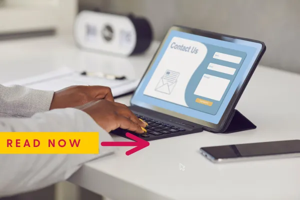
What Every Effective Contact Page Should Include
When you're building a site—especially with a focus on affordable and practical web design—your contact page is one of the first places you need to get right.
Whether you're working with a freelancer or a small agency offering affordable web design, make sure these essentials are built into your contact page layout:
✅ 1. A Clear Headline with Purpose
Your contact page shouldn't just say “Contact.” Make it more human and inviting.
Instead, use headers like:
“Let’s Talk”
“Have a Question?”
“Work With Me”
“Get in Touch”
These small touches give your web design personality—and help visitors feel more comfortable reaching out.
📌 This is a simple win that nearly every affordable web design provider can implement without increasing cost.
✅ 2. A Short, Friction-Free Contact Form
Your form should only ask for what’s essential:
Name
Email
Message
Optional:
Phone number
Subject dropdown (like “Support,” “Quote,” or “Collaboration”)
Too many fields = fewer form completions. Good design—especially affordable web design—keeps it lean.
Mobile users especially appreciate quick, simple forms that are responsive and easy to type into on the go.
✅ 3. Alternative Ways to Reach You
A smart contact page doesn’t assume every visitor wants to use a form.
Provide:
A direct email address
Phone number (if applicable)
Social links
Business hours
Messaging apps (like WhatsApp or Messenger if your audience prefers them)
By doing this, your web design gives users choice—and that’s great for both trust and conversion.
✅ 4. A Map or Business Location (If You’re Local)
If you’re running a local or regional business, include a small map or your address. This isn’t just useful—it’s an SEO win.
Google uses location signals from your contact page to boost local search visibility. This is often included in even the most affordable web design packages.
Bonus: You can embed Google Maps or Apple Maps with minimal code—great for speed and mobile-friendliness.
✅ 5. Confirmation Message or Auto-Response
After someone fills out your form, don’t leave them hanging. A polite confirmation like:
“Thanks for reaching out! We’ll respond within 1–2 business days.”
This small feature builds credibility, lowers bounce rate, and reassures your audience that their message isn’t going into the void.
✅ In smart, affordable web design, small automation touches like this make a big difference in perceived quality.
🎯 What Affordable Web Design Services Can Do for Your Contact Page
A well-designed contact page isn’t about looking fancy—it’s about being effective. The beauty of a truly affordable web design service is that it gets the basics right, with no fluff or waste.
Here’s what an experienced provider brings to the table when optimizing your contact page:
🧰 Technical Setup (Done Right)
Secure form setup that actually delivers messages
Mobile-friendly design for seamless user experience
Spam protection using CAPTCHA or honeypot methods
Fast load time by optimizing page assets
These are standard practices in reliable budget-friendly web design—and they make all the difference in performance.
🎨 Consistent, User-Focused Design
A good contact page isn’t just functional—it should feel like part of the brand. This includes:
Matching your site's fonts, buttons, and layout
Using branded icons or illustrations
Avoiding clutter while keeping things readable
Even in low-cost web design, consistency in branding goes a long way in building credibility.
🧠 Strategic Placement and Flow
Affordable doesn’t mean thoughtless. Skilled designers know how to:
Add calls-to-action throughout your site that naturally lead to your contact page
Use sticky navigation or footers to keep “Contact” accessible at all times
Test form positions, button colors, or microcopy to see what gets the best results
This is what separates cheap design from affordable web design that actually works.
Simple Contact Pages That Actually Convert
In the world of affordable web design, the contact page is one of the highest-ROI elements you can invest in.
It’s easy to set up, low on complexity, and—when done right—powerful in impact. Whether you're launching a small business site or refreshing an old one, web design that focuses on usability and conversion should always prioritize the contact experience.
Let your users reach you without confusion. Guide them gently. Show them you’re real, responsive, and ready to connect.
That’s good business—and good web design, no matter your budget.

🧪 What I’ve Seen Work on Client Projects
Over the years, I’ve worked on dozens of startup and small business websites—each with different goals, audiences, and resources. One thing they all had in common? The contact page was often underperforming until we gave it a little love.
The good news is, most improvements didn’t require complex redesigns or big budgets. Just smart, affordable web design decisions focused on usability and clarity.
Here are a few real examples that show how impactful small changes can be:
A local service business increased leads by 40%
We moved their contact form above the fold on the homepage instead of hiding it behind a button. That single change made the form easier to find, and inquiries went up almost overnight.
This was part of a simple web design refresh—nothing fancy. But it worked because it respected how real users behave.
A creative freelancer simplified to a one-question form
Instead of a full contact form with multiple fields, they added a single open-ended field with the prompt: “Tell me what you’re looking for.”
Not only did this reduce friction, it also improved the quality of inquiries, saving time and making projects easier to scope. It was a perfect example of how lean, budget-friendly web design can actually improve the client’s workflow.
A coaching website added a voice memo tool
To make their contact page more interactive, we embedded a voice recording feature. Visitors could leave short audio messages instead of typing out long emails—especially helpful for mobile users or busy professionals.
The result? Higher engagement from mobile traffic and a more personal connection up front.
And again, this was implemented through affordable design tools that didn’t require custom development.
What ties all these examples together isn’t a big budget—it’s strategic thinking. Good web design doesn’t have to be expensive. It just needs to solve problems, guide users, and encourage real interaction.
If your contact page isn’t converting, the fix might be simpler than you think. Sometimes, all it takes is a fresh perspective and the right set of affordable tools.
🚀 Final Thoughts: Keep It Simple, Make It Count
A simple contact page might not seem like a big deal—but it’s where curiosity turns into connection. And that’s the heartbeat of any business.
Whether you’re working with a team or going solo, make sure your designer—especially if you’re hiring through affordable web design services—treats the contact page with the attention it deserves.
Because in the end, the easier it is to reach you, the easier it is to trust you—and buy from you.
👉 Ready to launch a smart, clean website without overspending?
Start with affordable web design services that understand what really matters.
📩 Let’s build your perfect contact page together.
More Articles
Web Design Articles
Turn Clicks to Cash: Build a Web Template That’s Straight Heat
Master the Art of Web Page Outlines: Your Blueprint for a High-Performing Website
8 Must-Have Features for the Perfect Video Website Template (Make Your Videos Stand Out!)
The Ultimate Cyber Security Website Design: Protect & Impress in 2025!